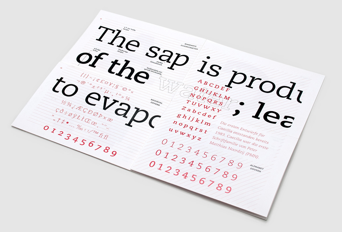
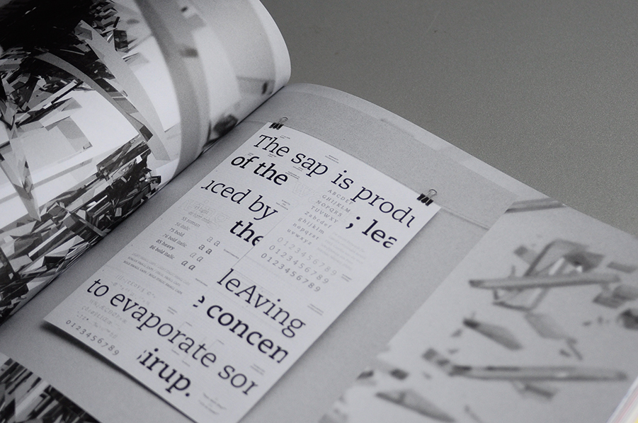
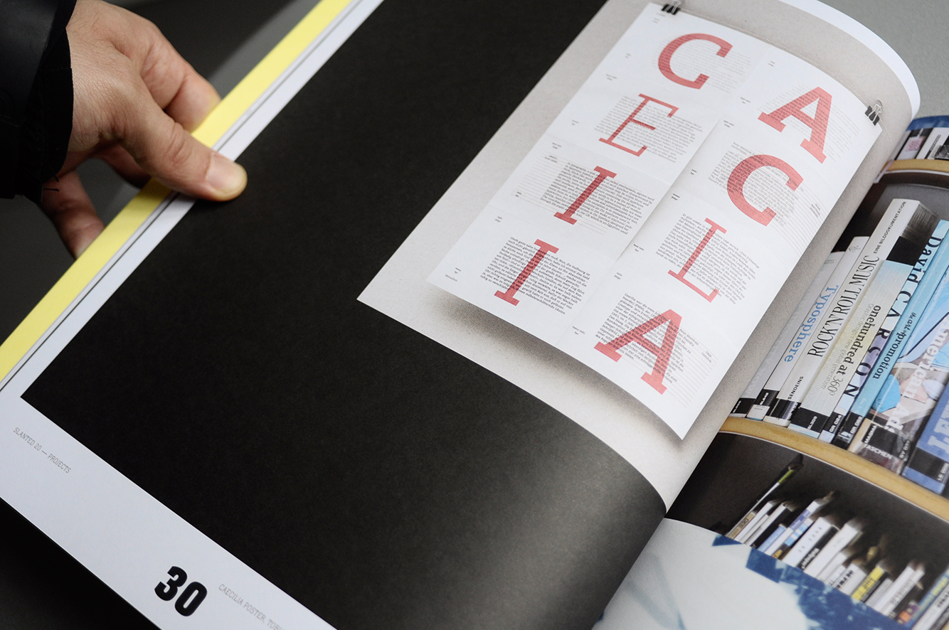
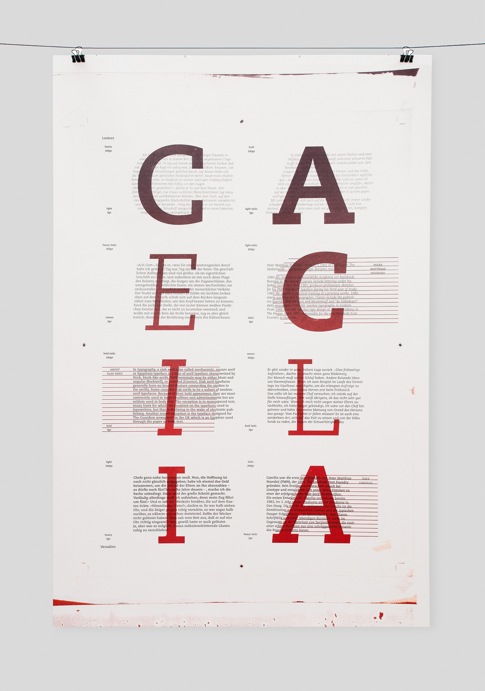
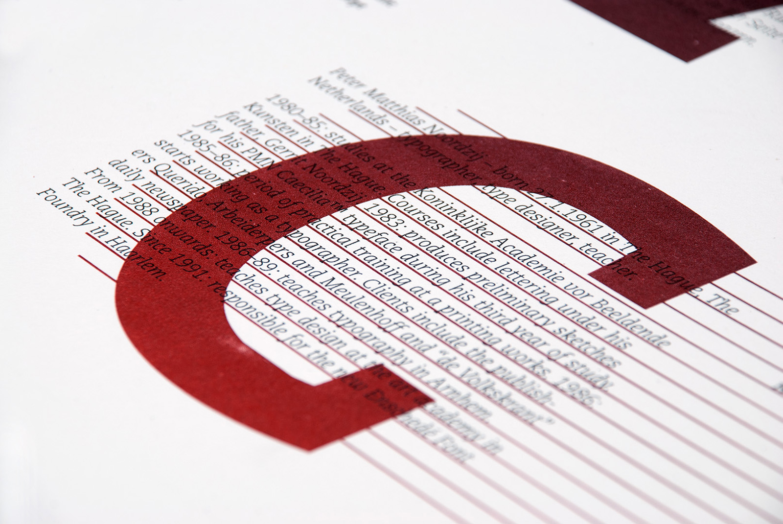
caecilia digital
year: 2012
type: type, poster
the posters display all major characteristics as well as all the different font-styles caecilia has to offer.
published in SLANTED Stencil
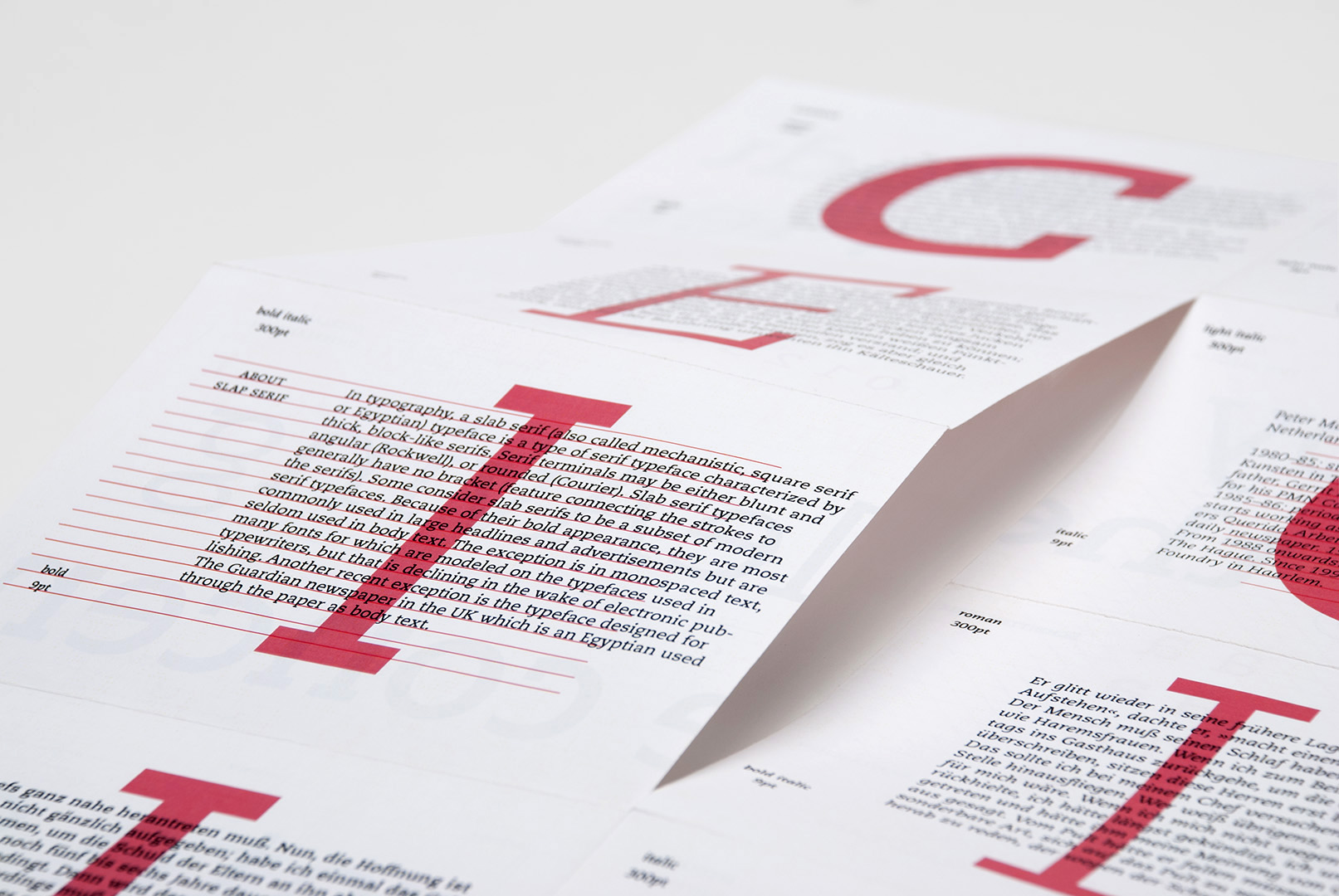
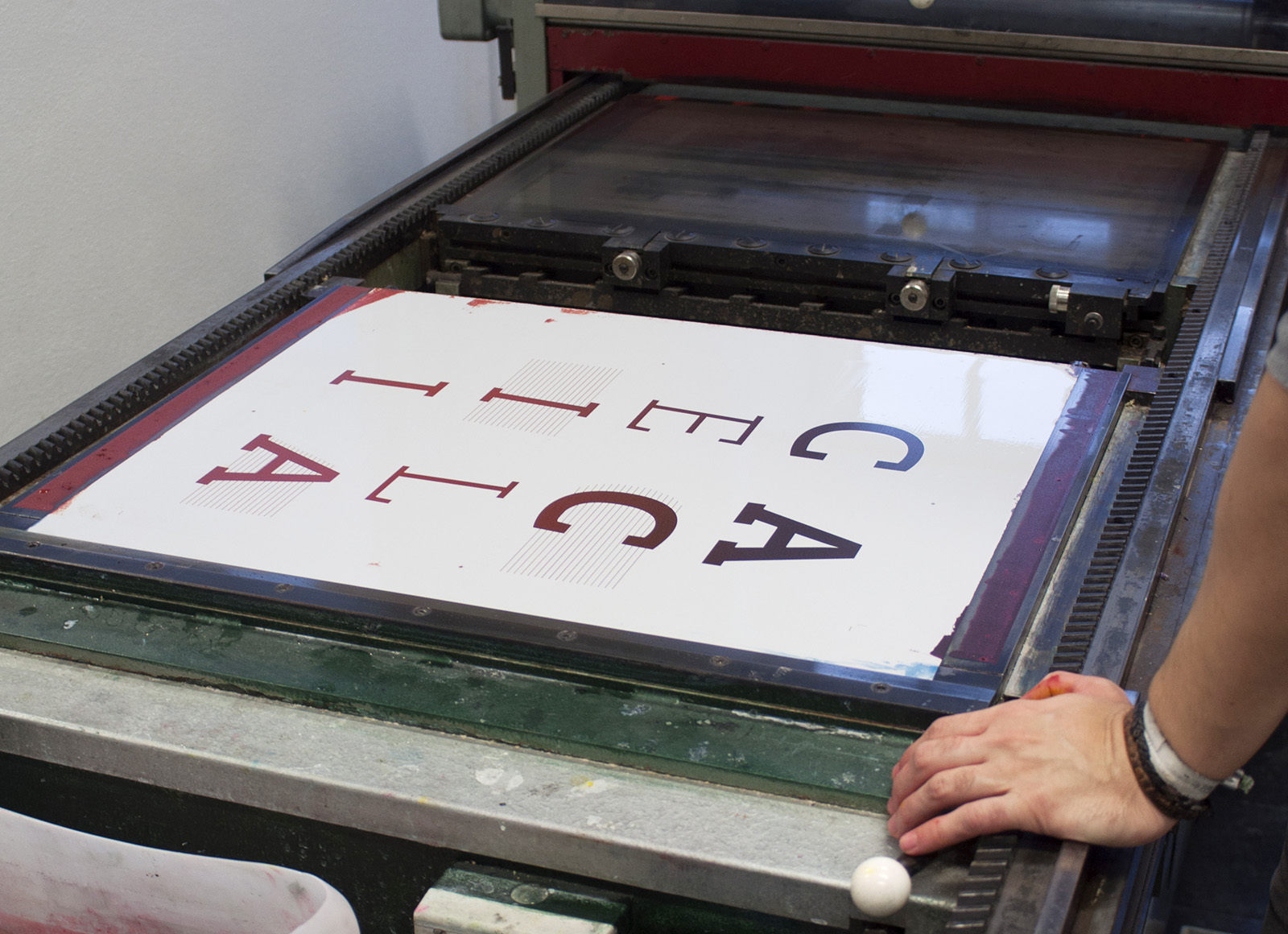
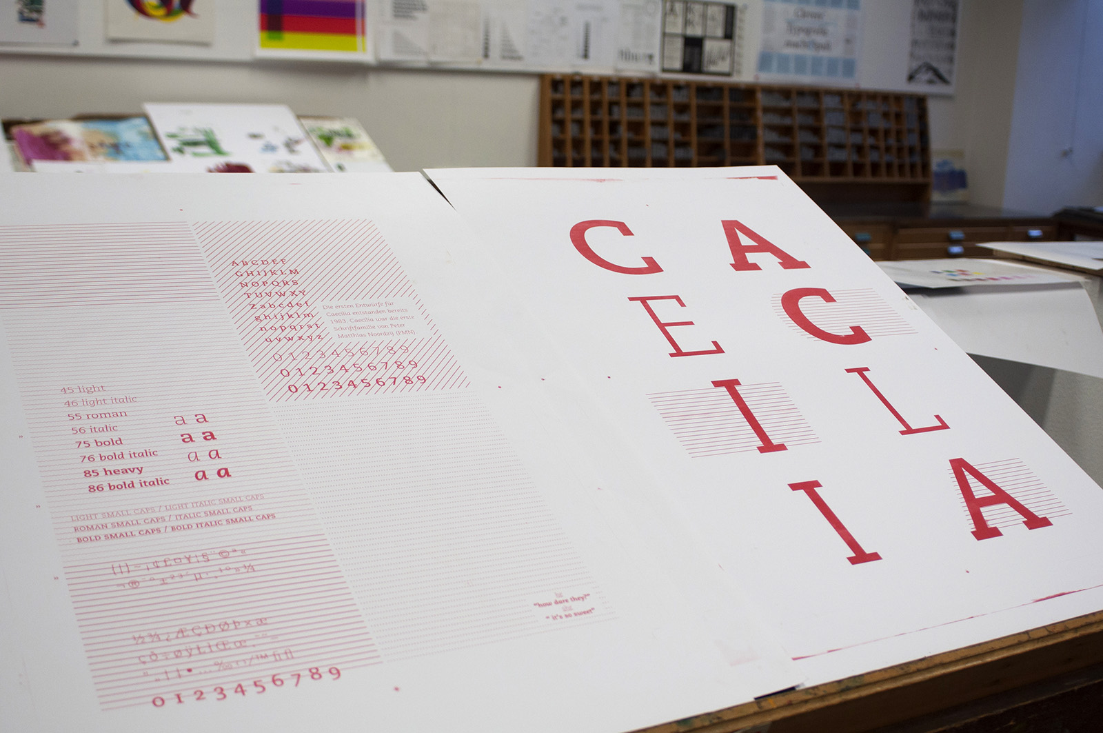
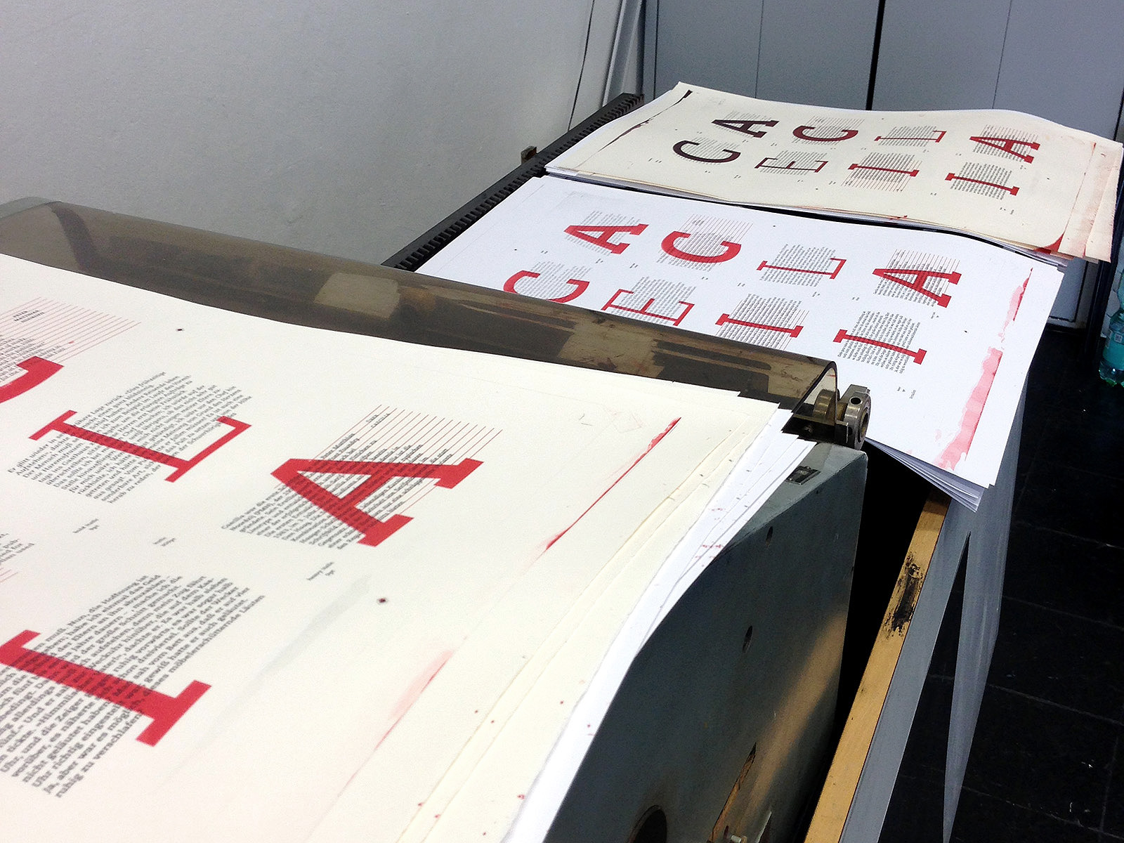
caecilia offset
year: 2012
type: type, poster
the posters display all major characteristics as well as all the different font-styles caecilia has to offer.g
offset version was printed with different gradients on offset machine
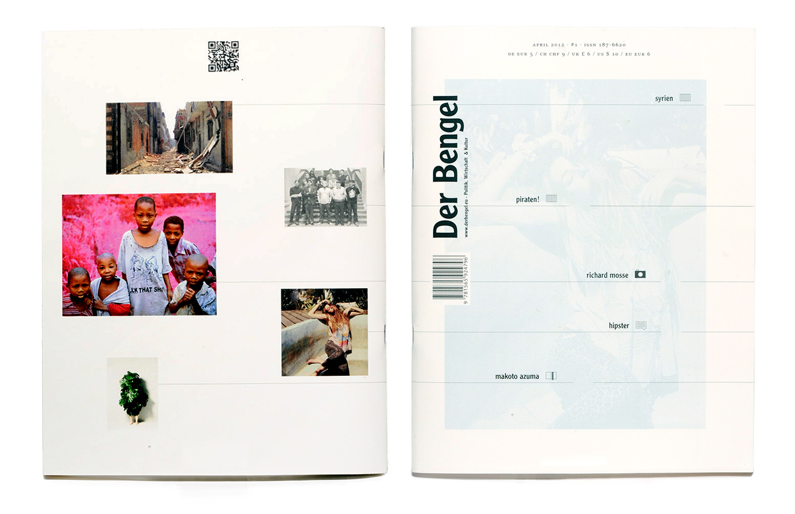
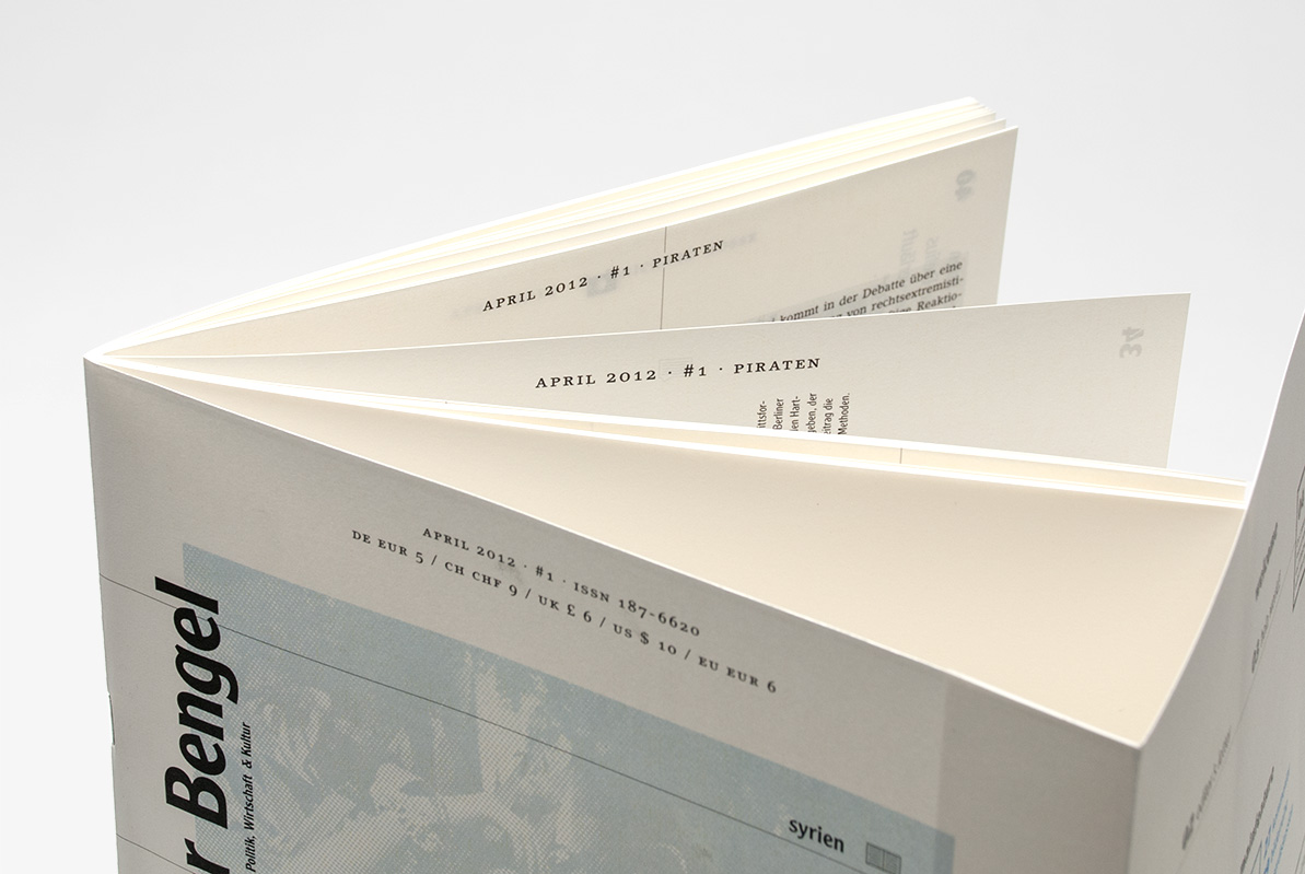
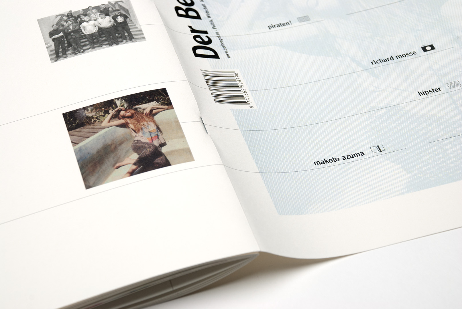
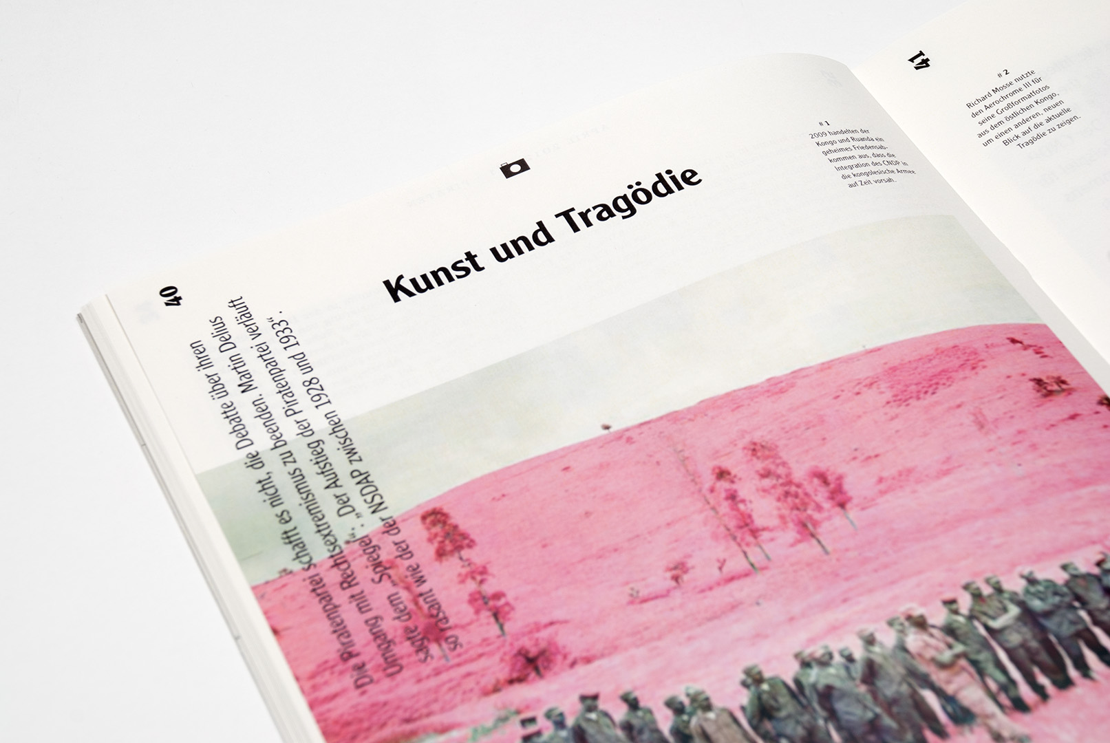
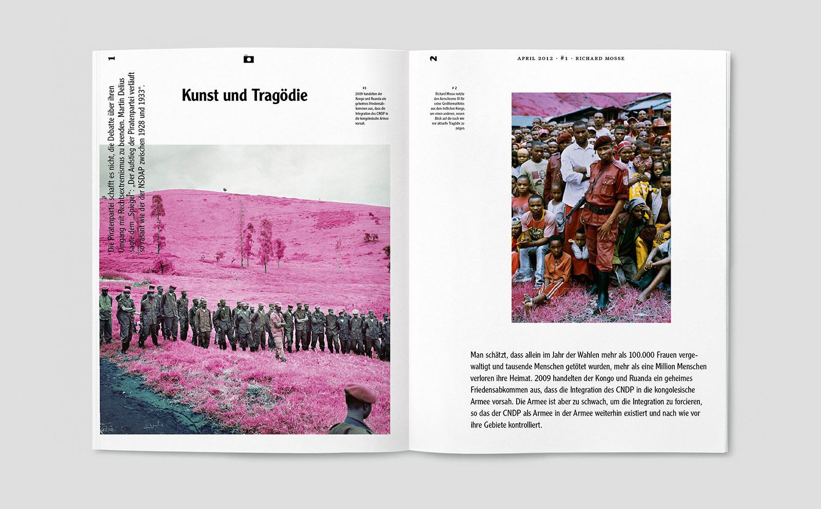
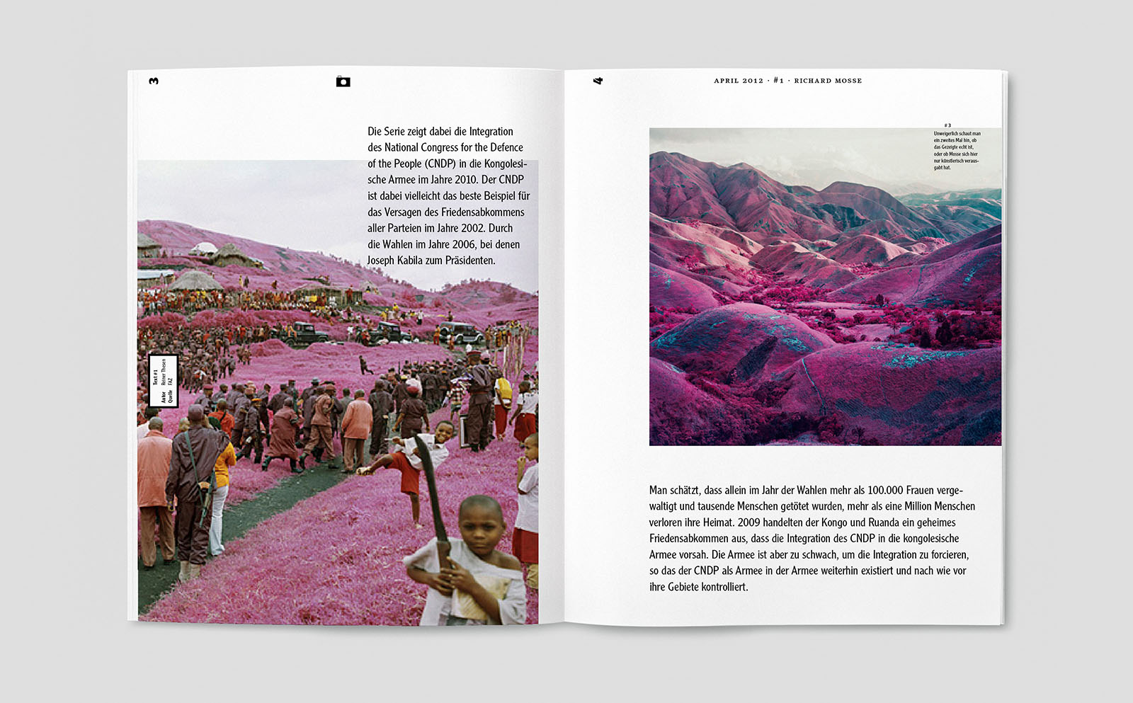
bengel magazin
year: 2011
type: editorial
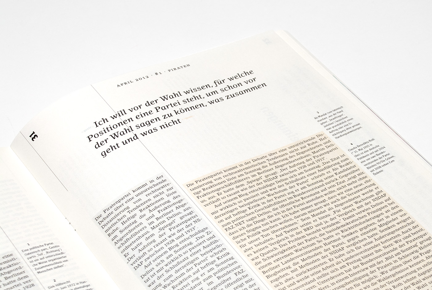
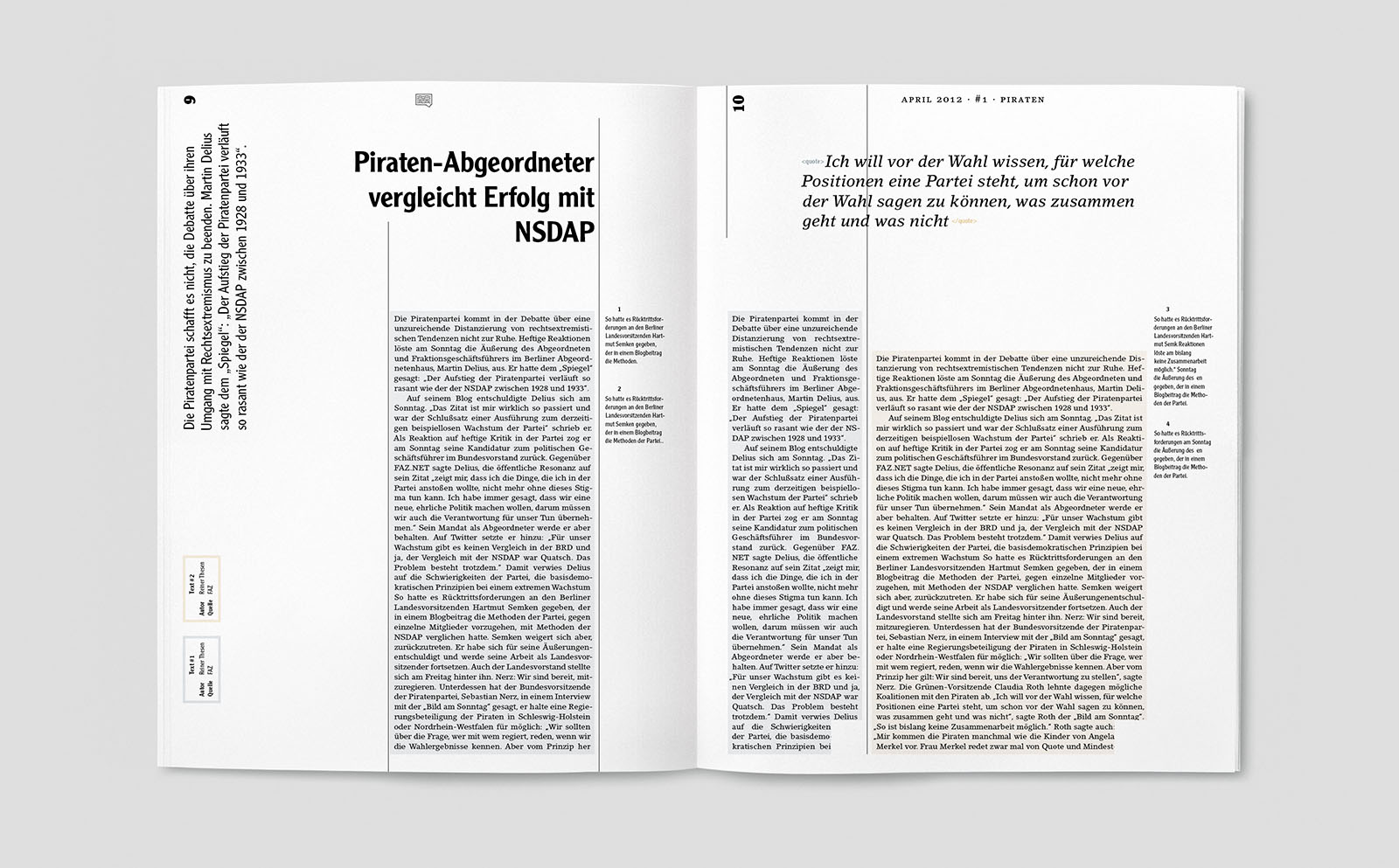
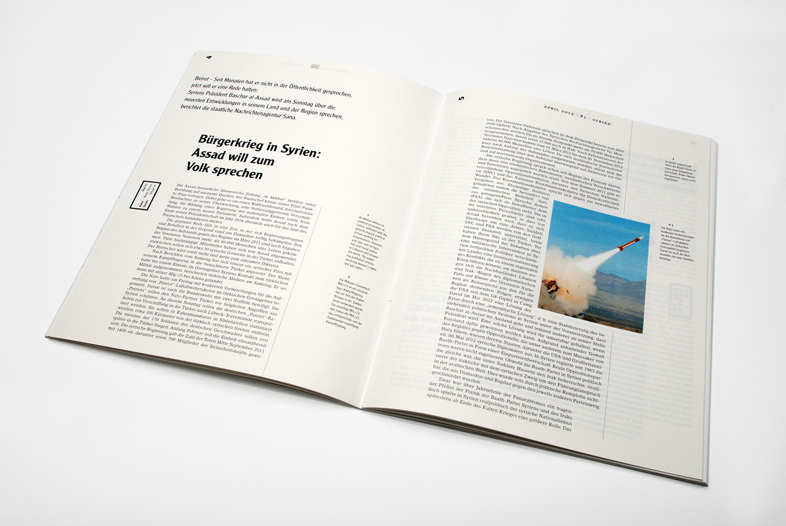
„Der Bengel“ was developed as a web-toprint magazin-concept. It deals with topics in the areas of culture, politics and science. Subjects are discussed by different authors. This allows the reader to get a more objective view on a problem to make up his/her own opinion on it.
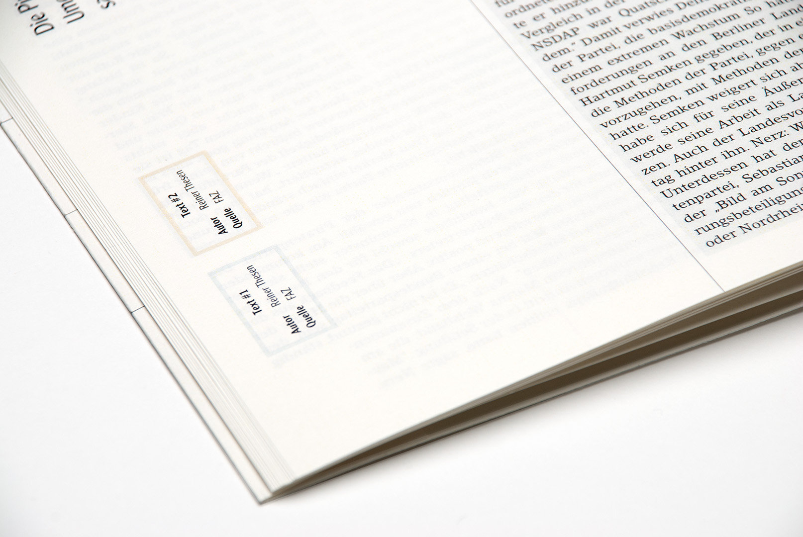
The Design is structured, clear and simple. One of it’s key elements is it’s striking mixture of typefaces and the use of horizontal and vertical lines that refer to newspaper layouts. Furthermore texts from different sources on a common subject differentiate by their background-color.
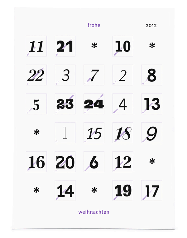
calender
year: 2012
type: type
The shown advent calendar was created as a free project and shows a different approach to christmas calendars. Behind the little doors is not only chocolate but also a red heart-shaped sort of pixel image.
In comparison to conventional advent calendars the numbers on the windows get to be the protagonists. 24 typefaces convey different atmospheres. The overall design of the calendar is simple and reduced to a minimum in order to leave enough attention to the numbers. A loading-bar displays the progess towards christmas.
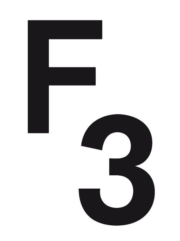
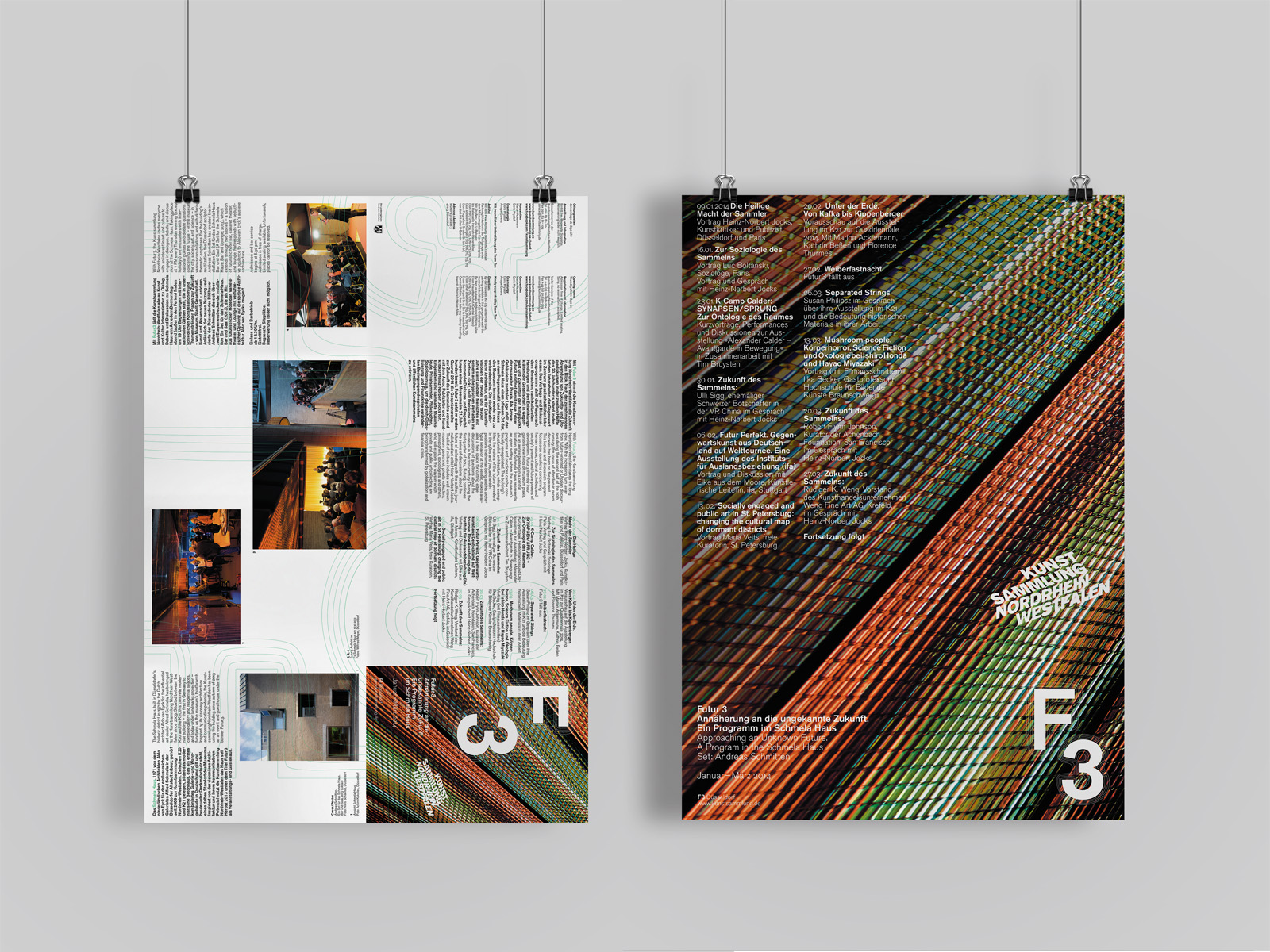
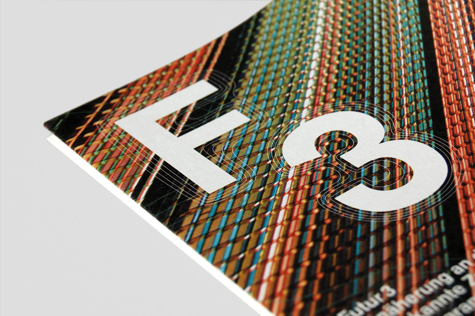
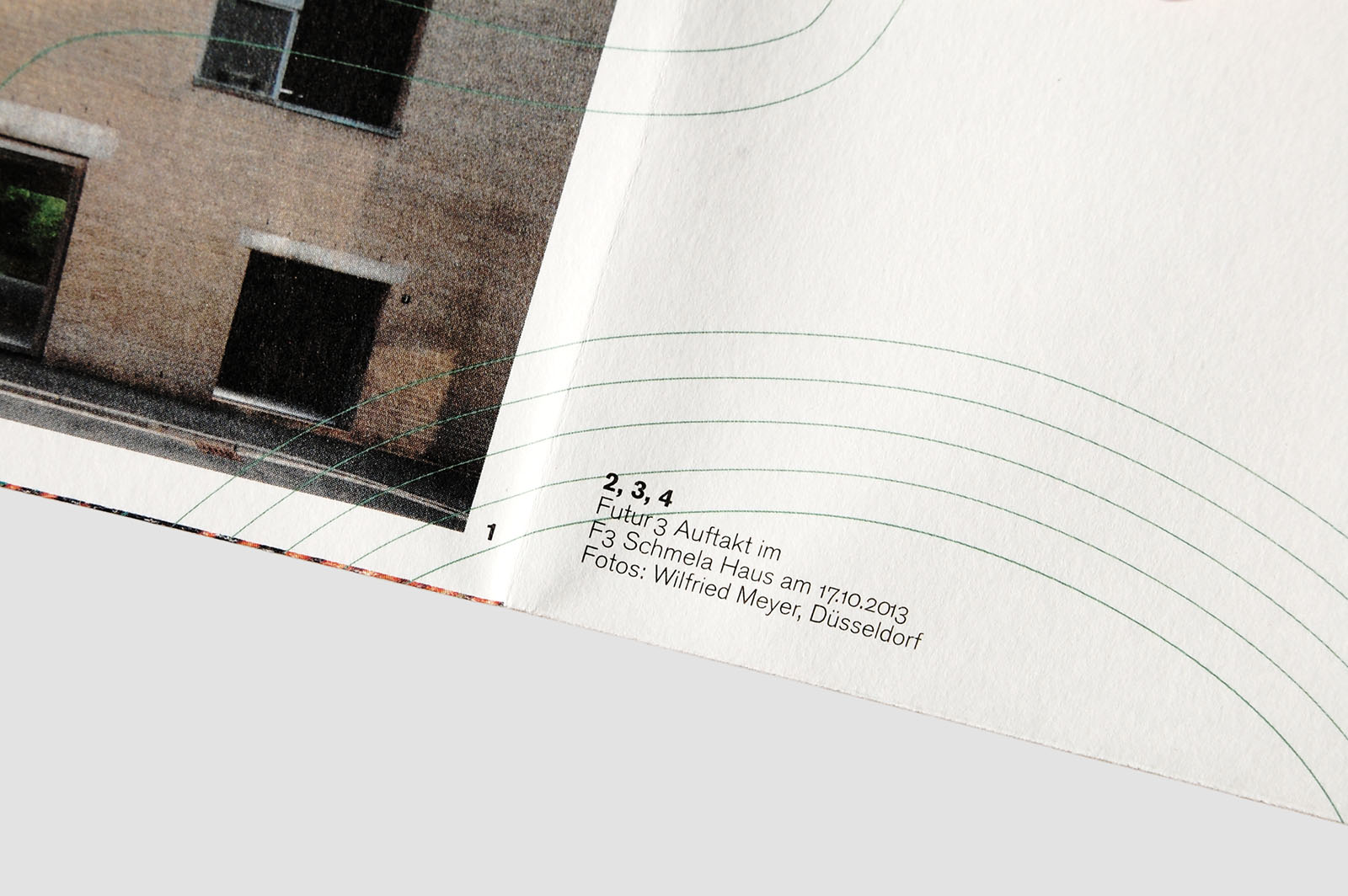
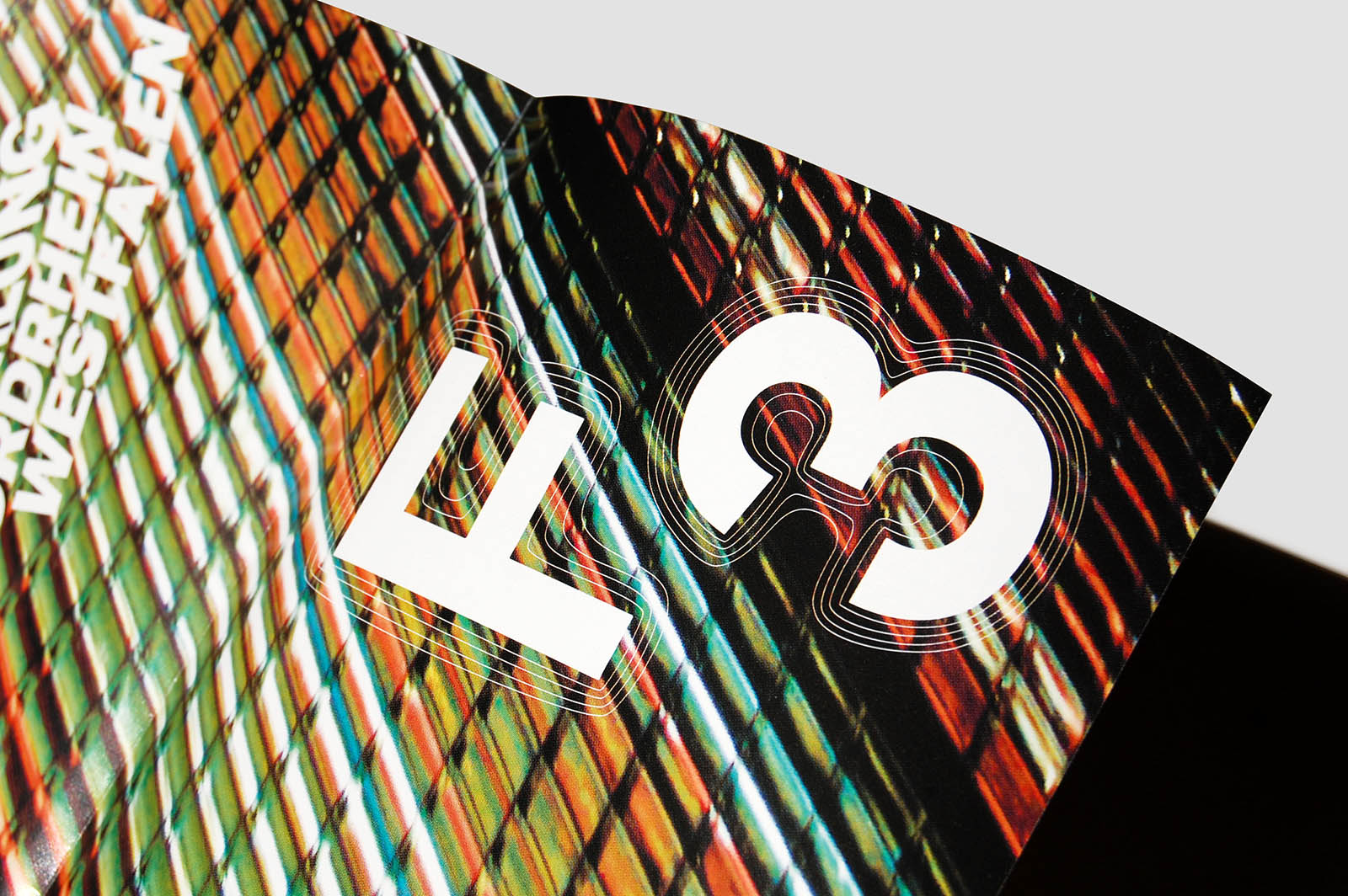
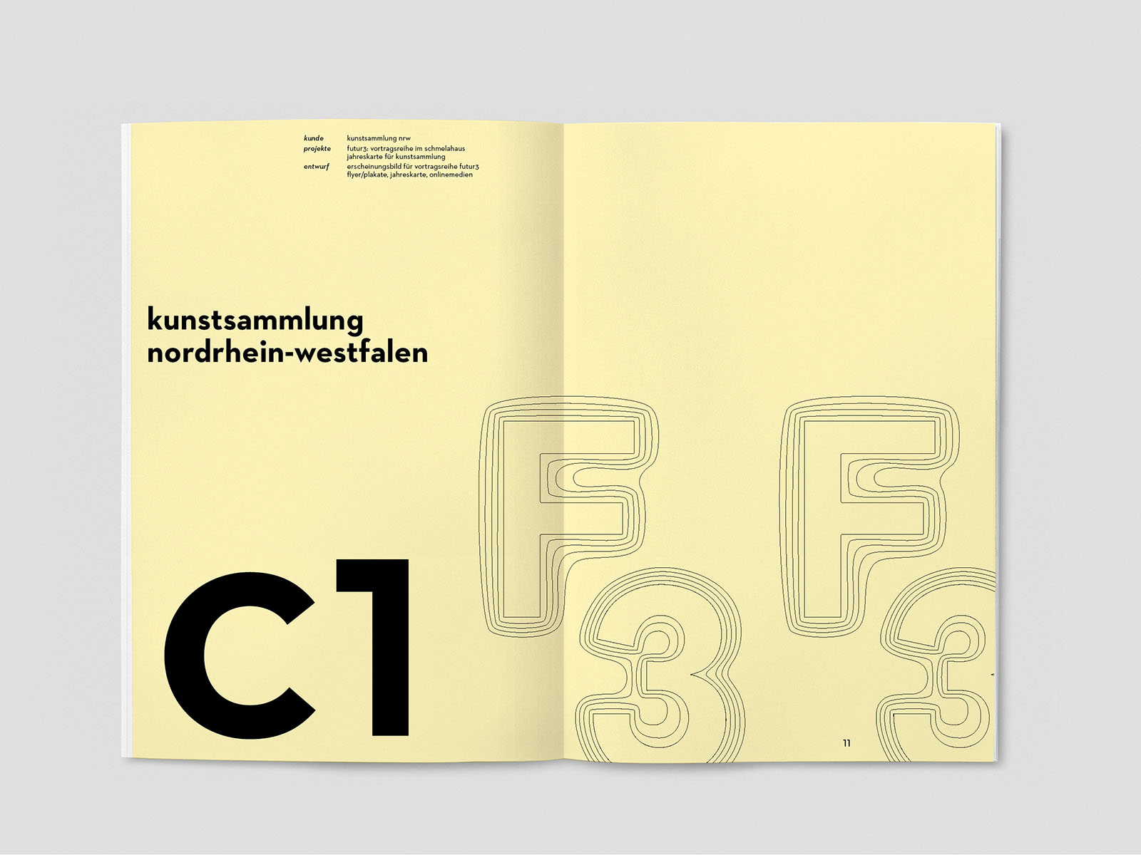
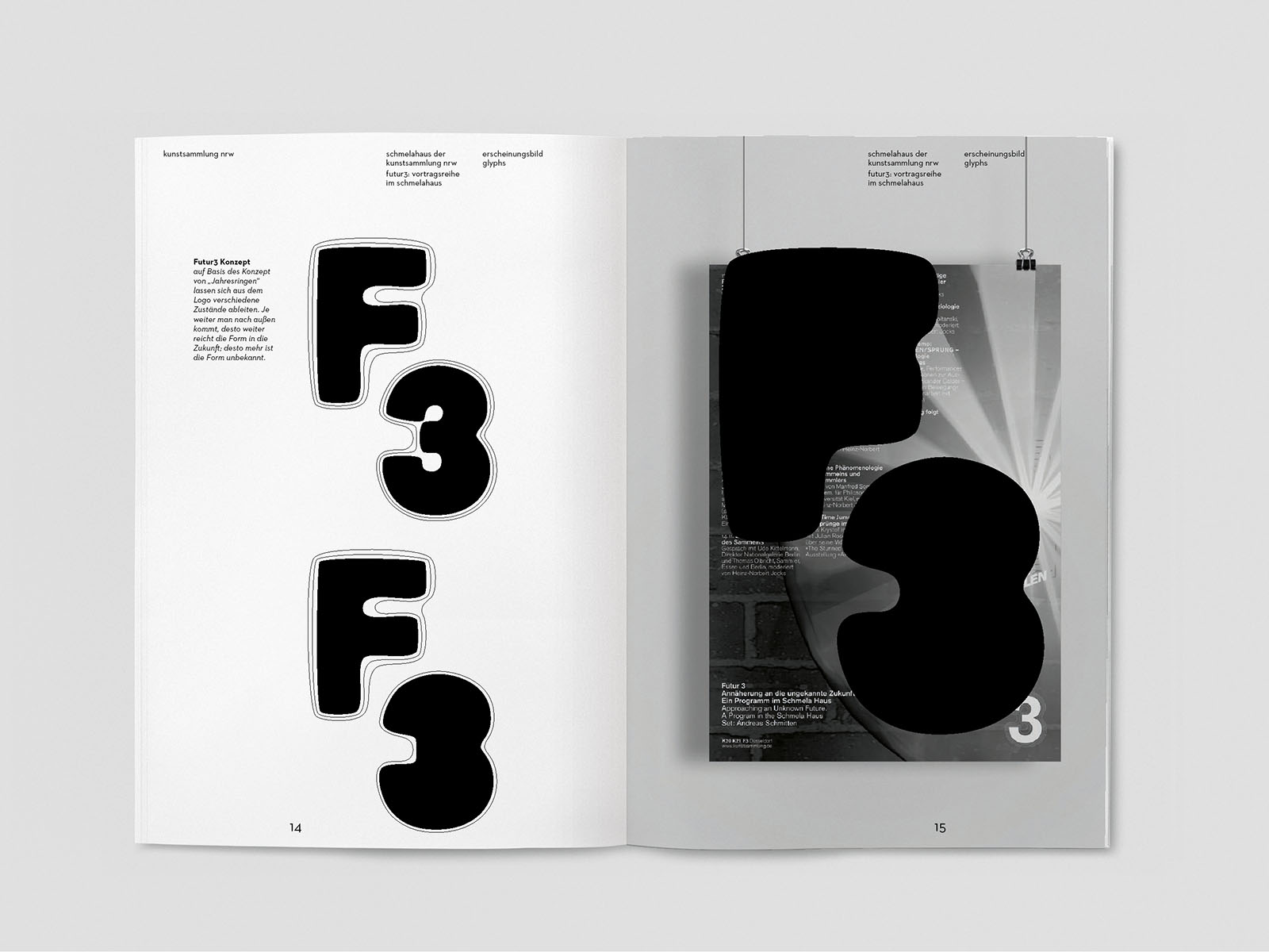
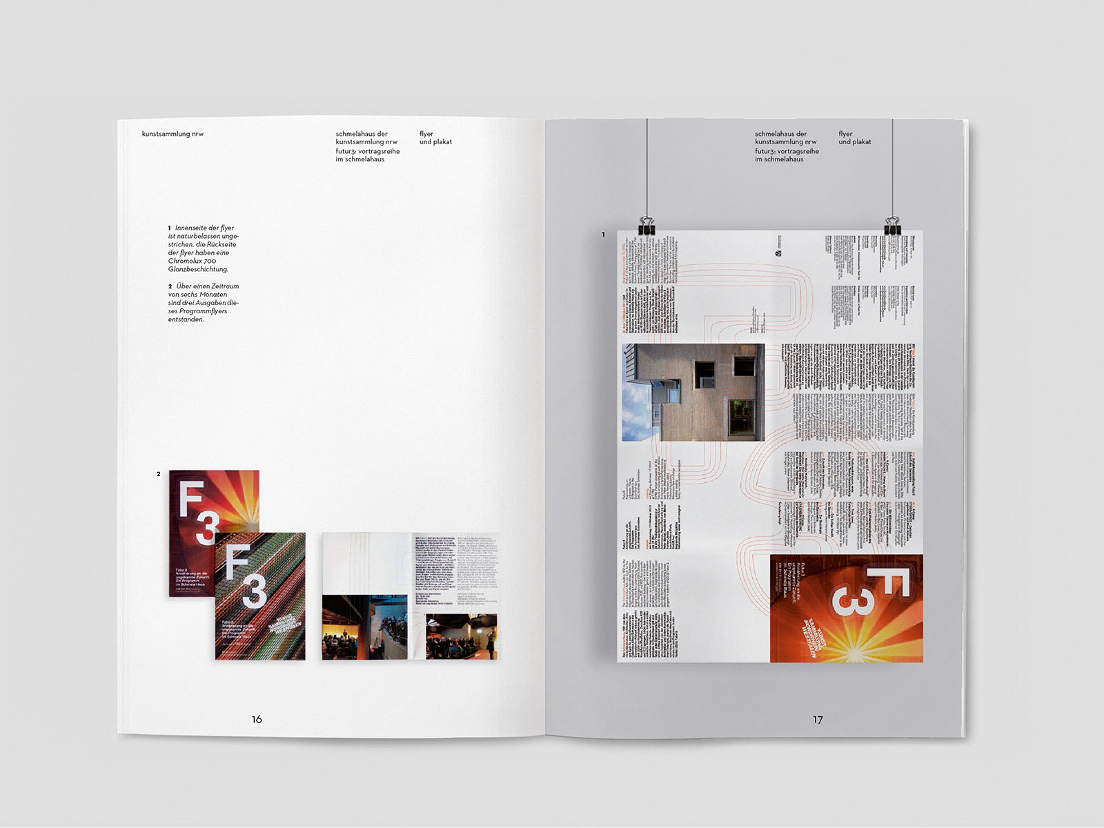
futur 3 (L2M3)
year: 2013/2014
type: type, lecture, cooperation (mitarbeit)
"Approaching an unknown future". With Futur 3, the Kunstsammlung NRW takes the longview. This lecture and discussion program focuses on questions concerning human nature, cultural activities, and society’s present and future powers of development. Futur 3 thereby inaugurates new fields of museum praxis.
The Logo translates the approach to the unknown future into a visual language. The further one looks into the future, the less clear it gets. The outlines of the abbreviation F3 give an outlook to an indistinct future shape. The minimalistic but expressive outlines are characteristic for the identity of the program and will be used in posters and broschures.
L2M3 cooperation
Project was worked on under the supervision of L2M3 staff. The project shown is copyrighted by "L2M3 Kommunikationsdesign GmbH".
Visit l2m3.com for more information on the studio.
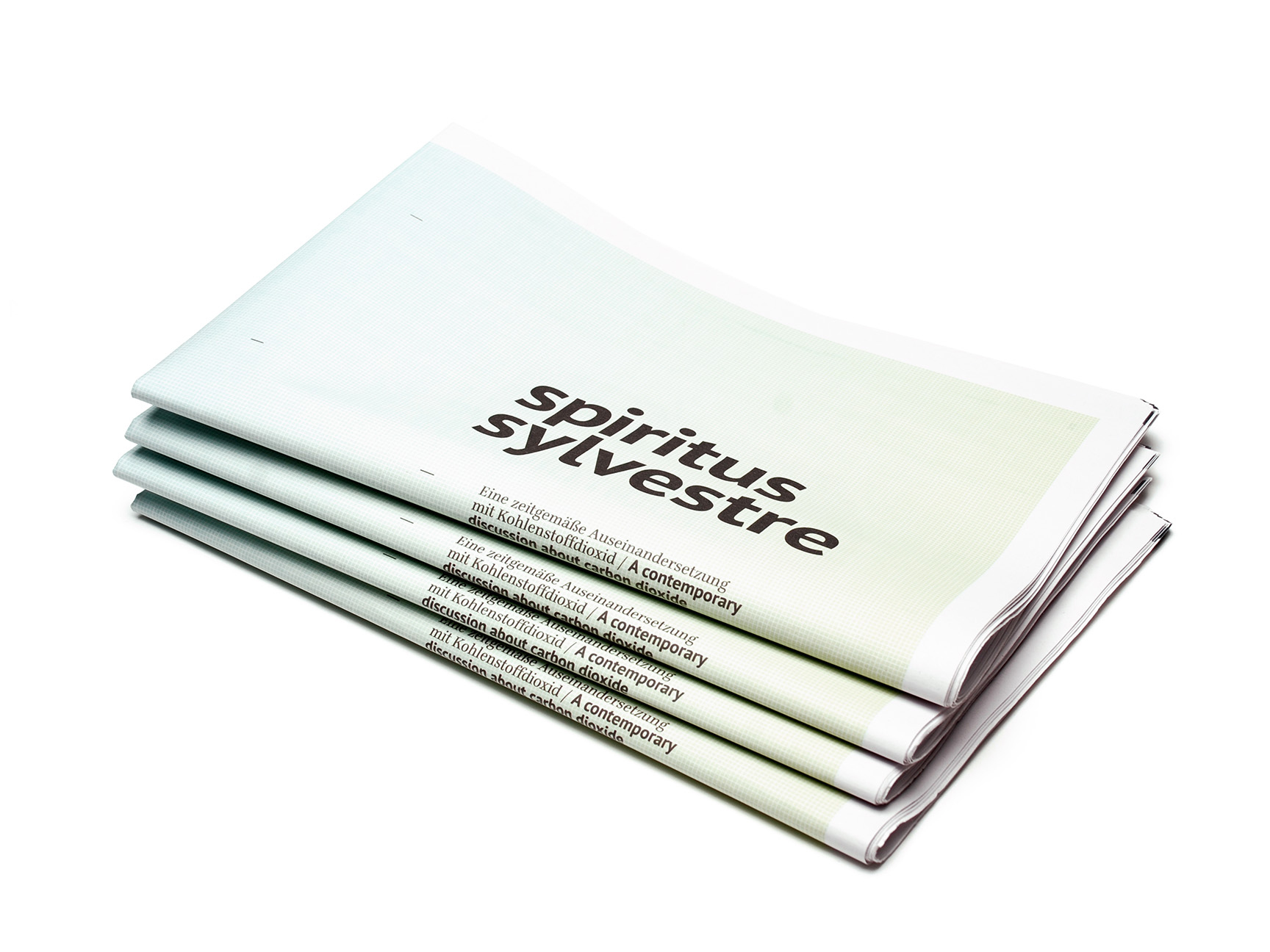
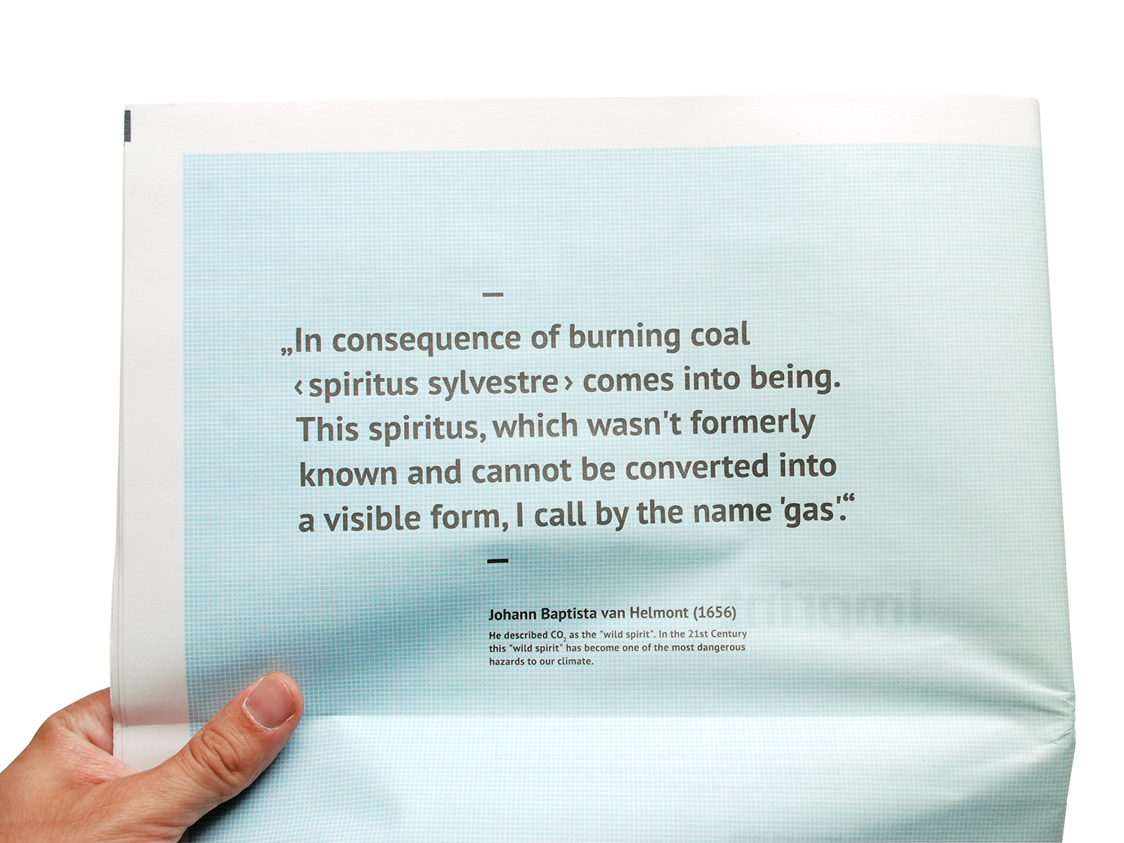
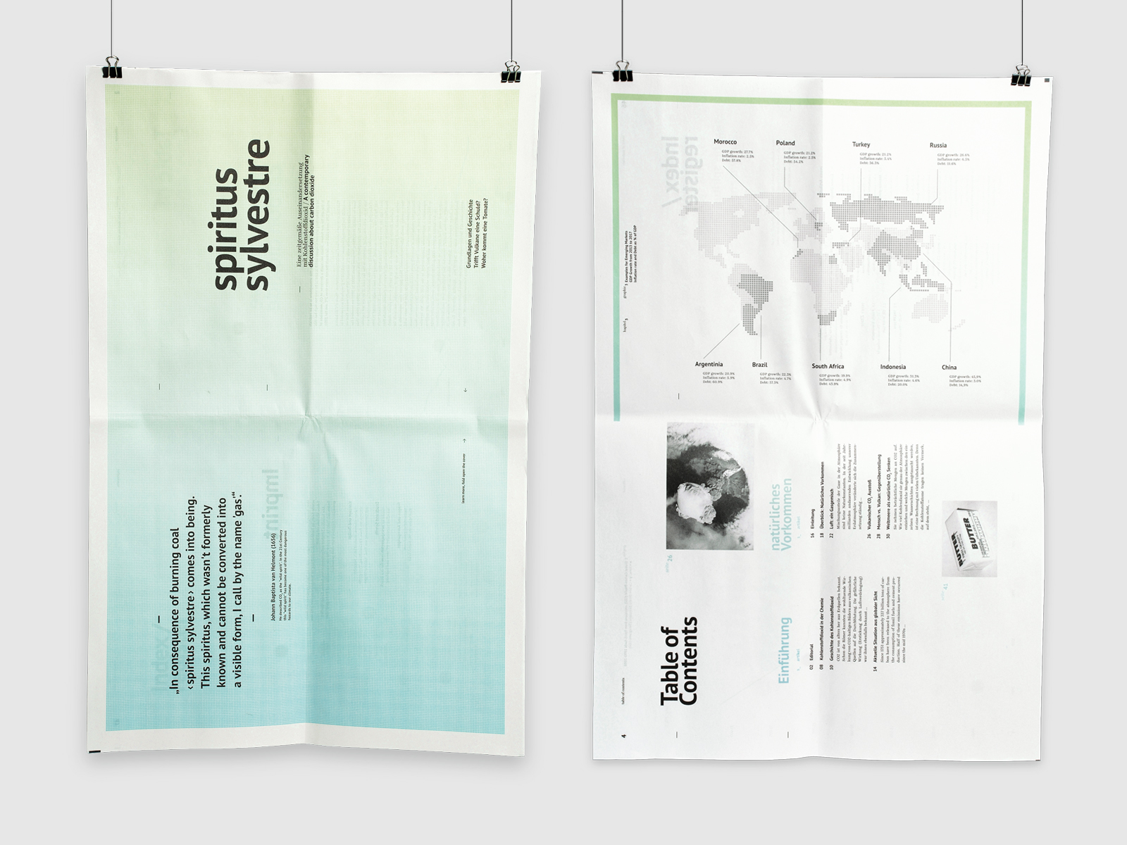
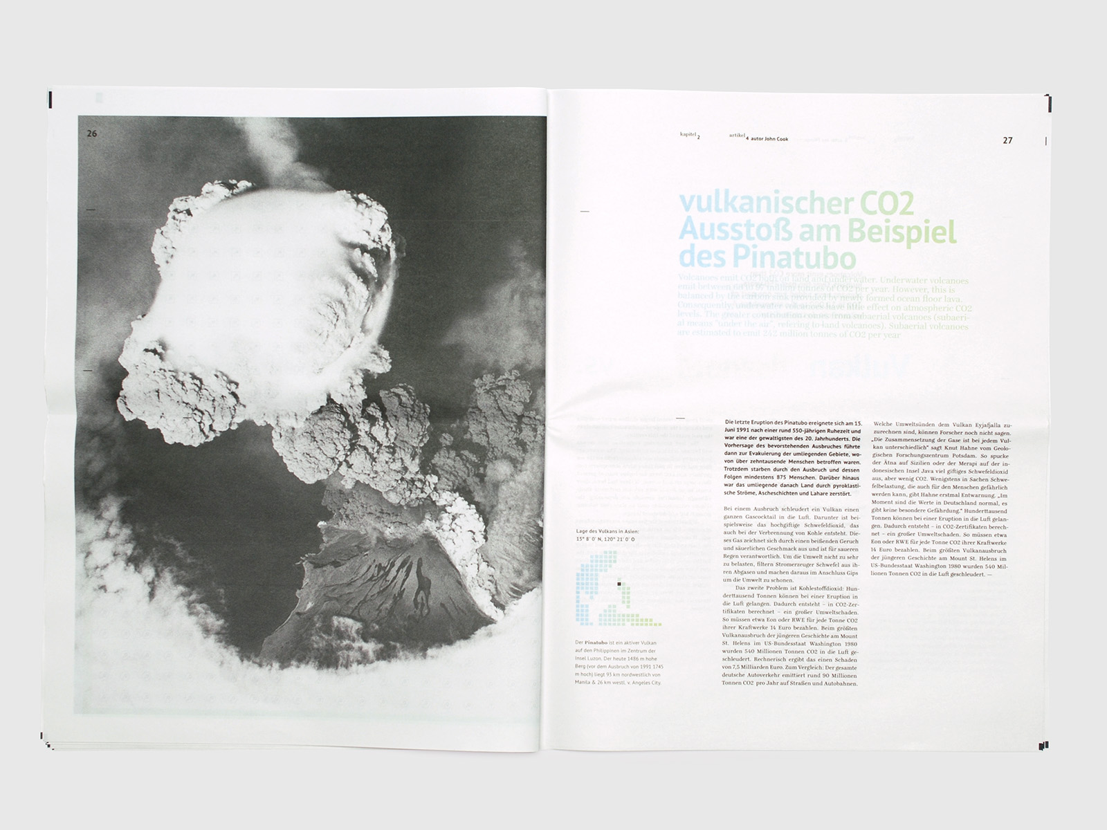
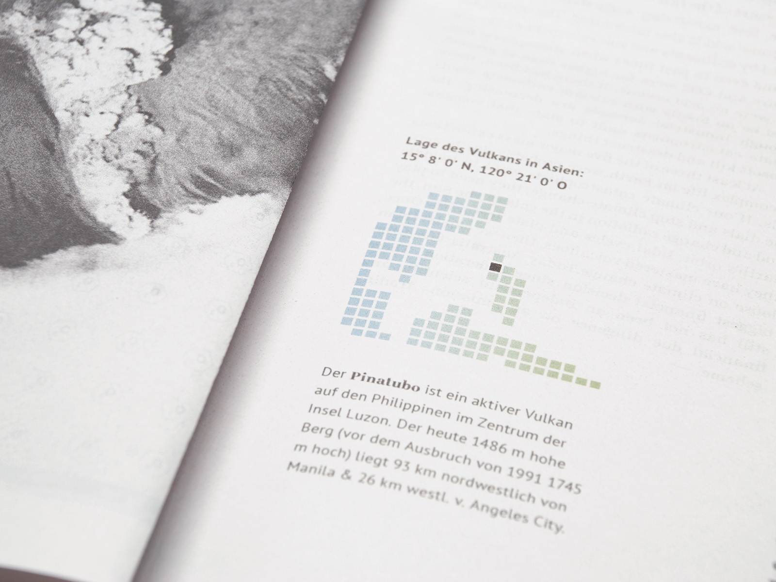
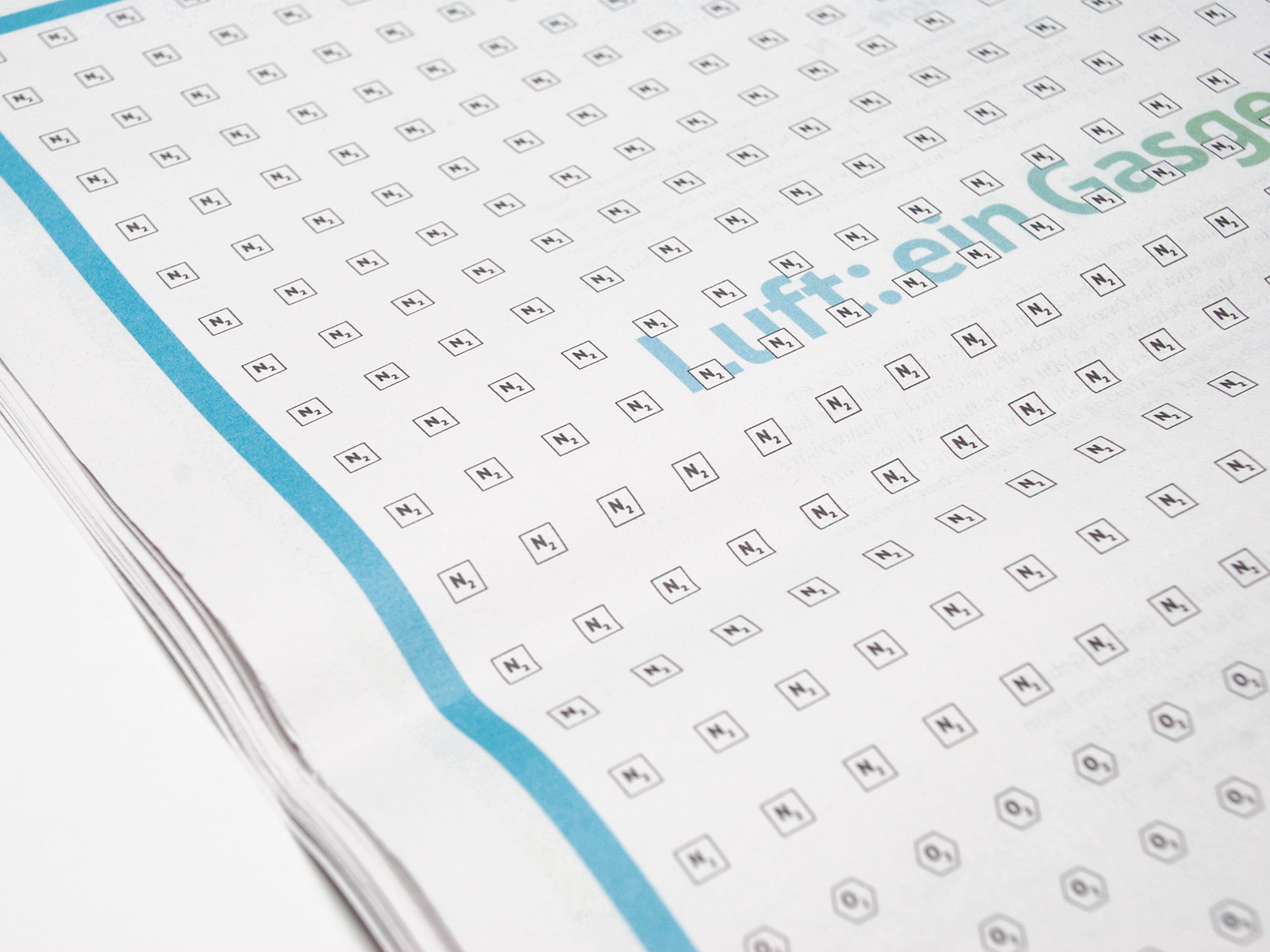
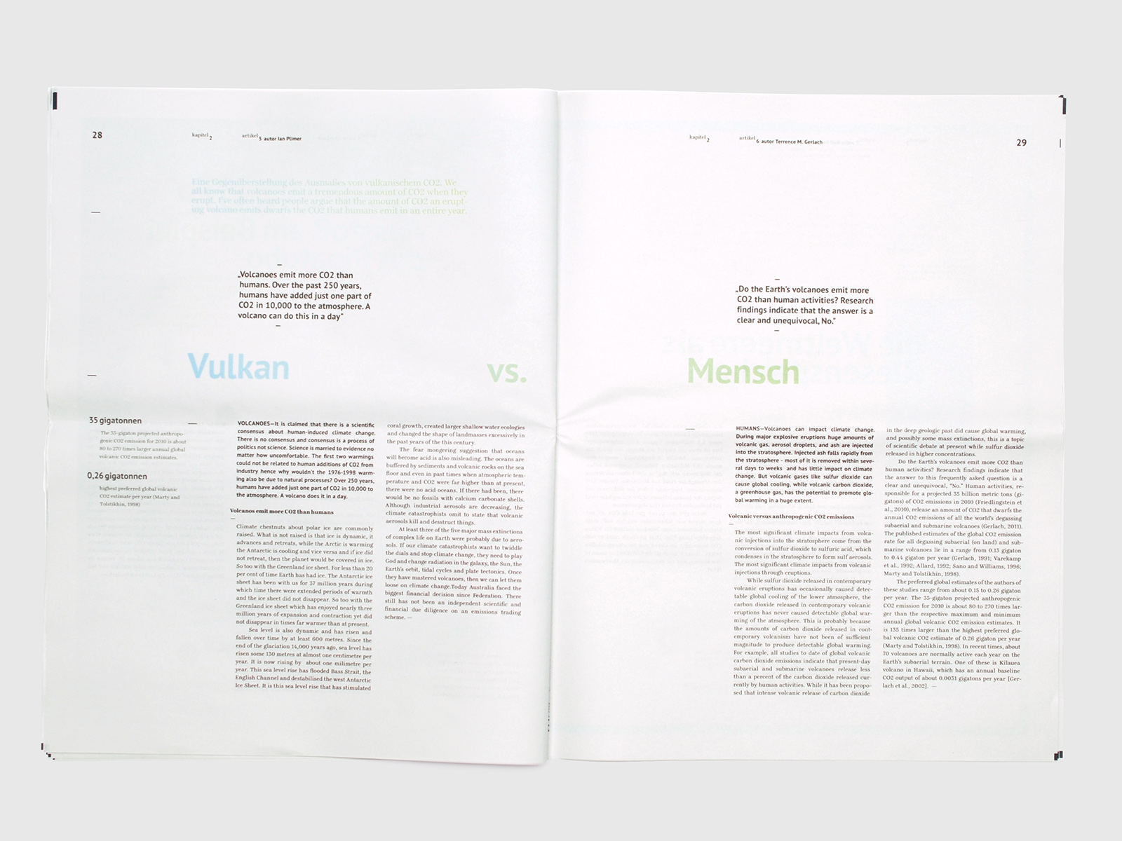
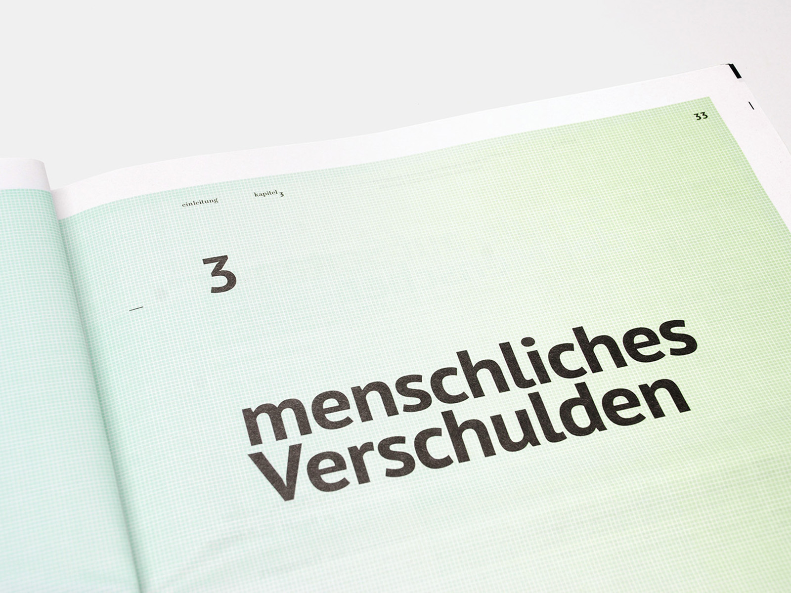
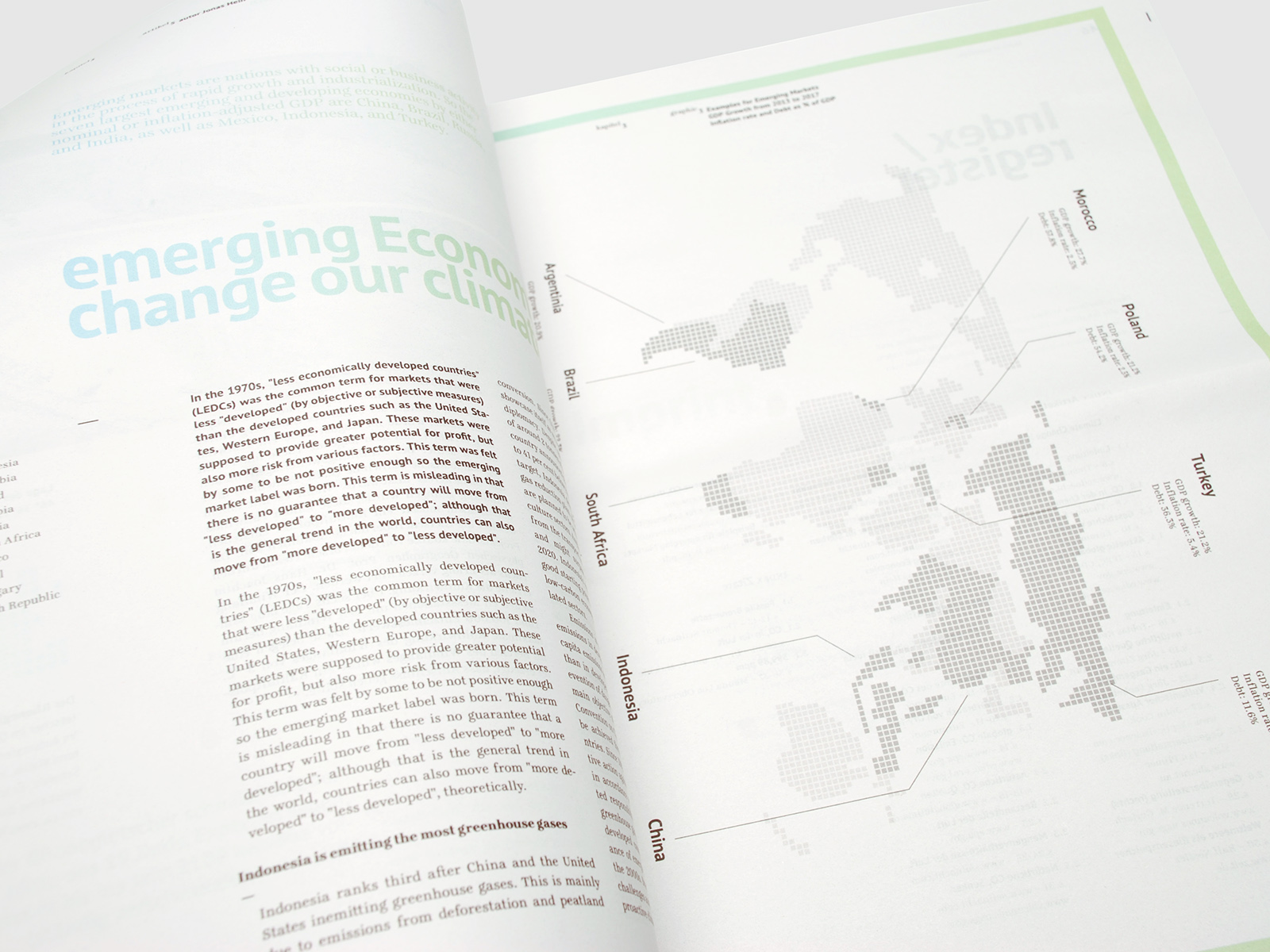
spiritus sylvestre
year: 2012
type: type, editorial
The newspaper-sized work features a range of infographics that show hisctorical events as well as upto-date information about pollution or emissions of carbondioxide.
As one of the key visual elements the line spacing for the headlines was reduced to a minimum in reference to CO2 taking away our air to breathe.
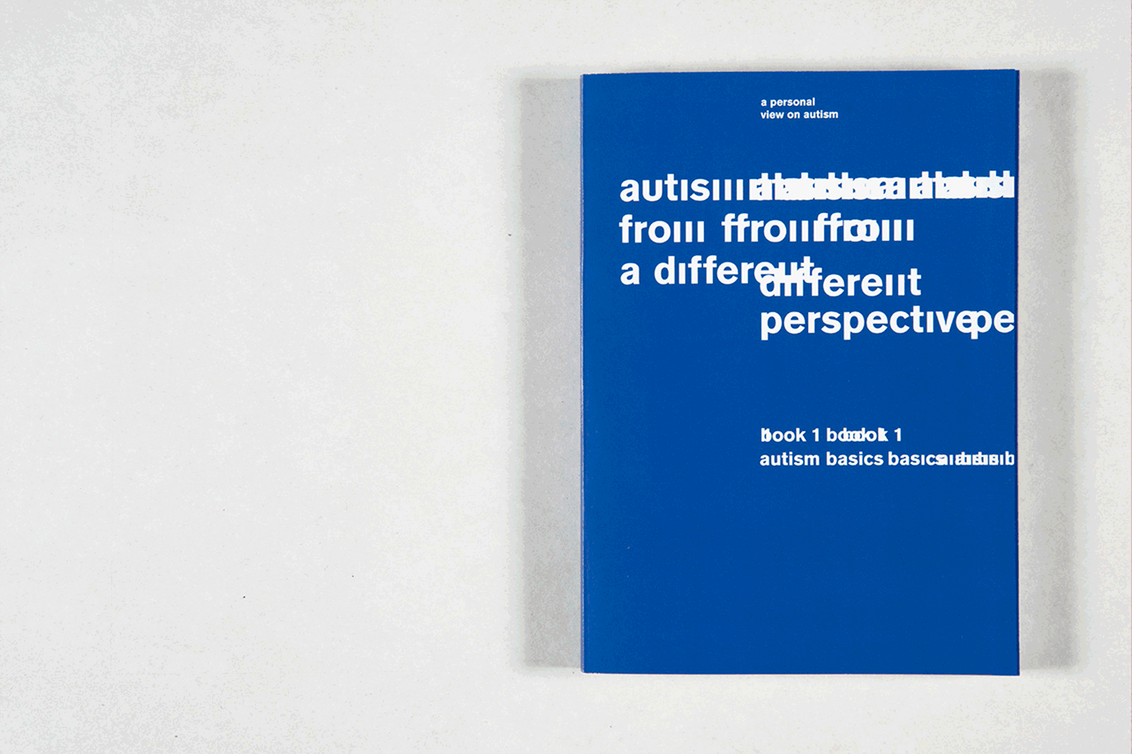
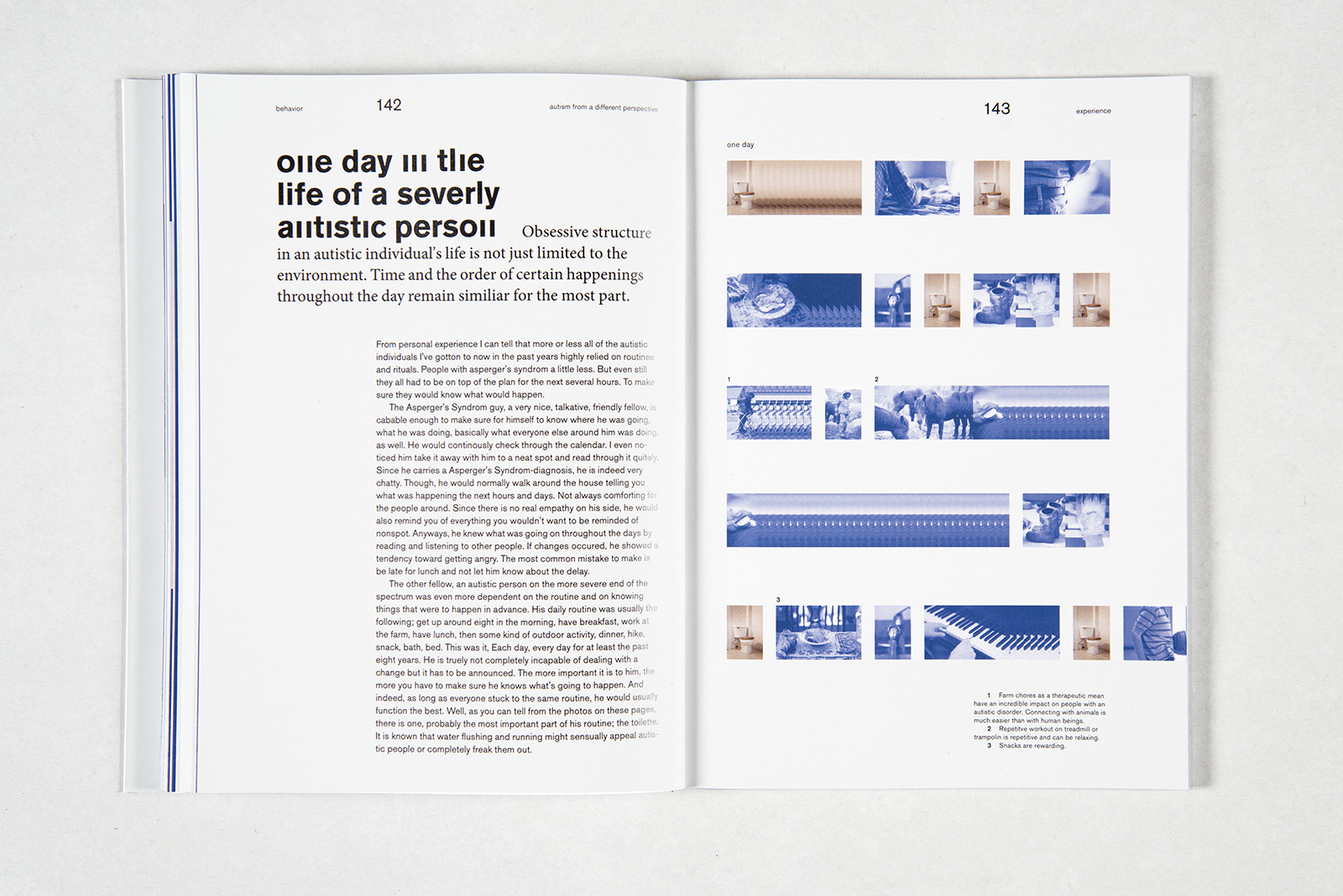
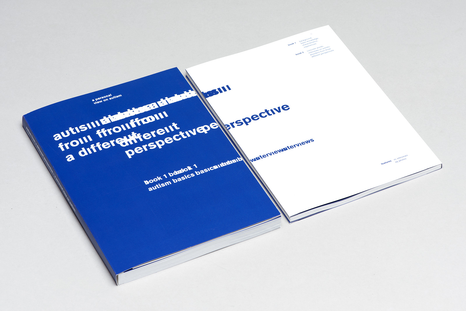
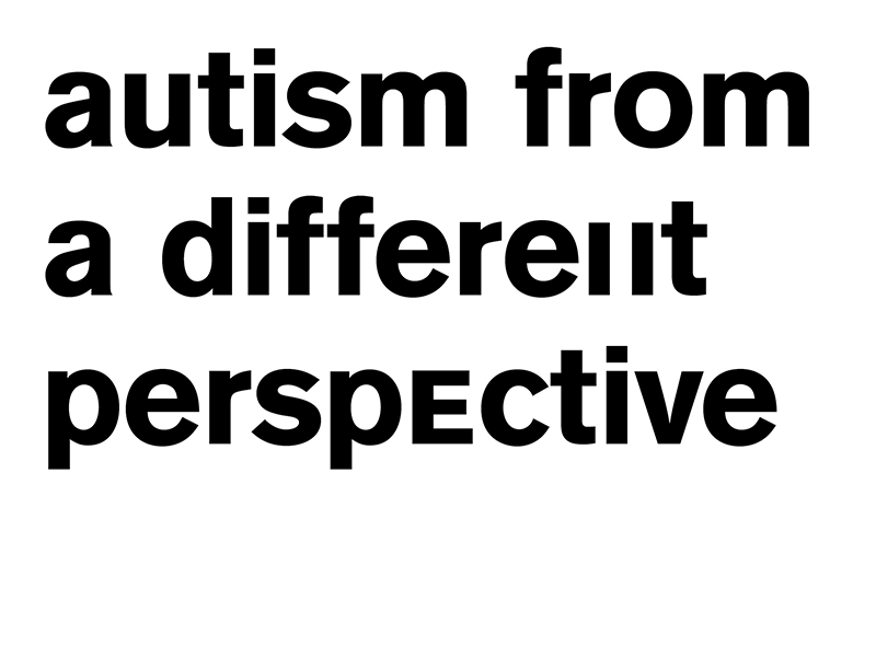
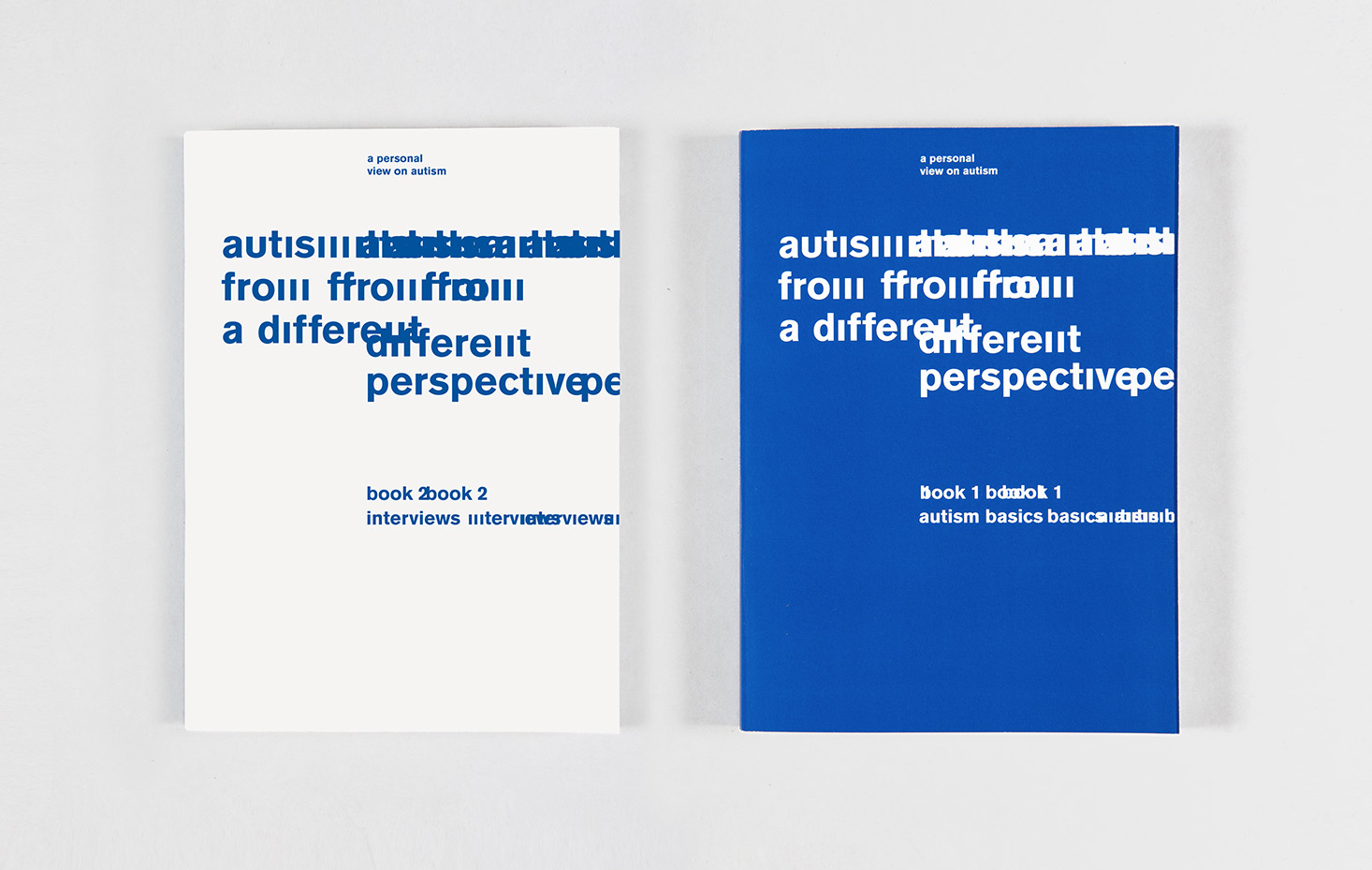
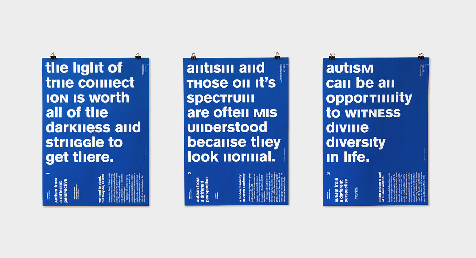
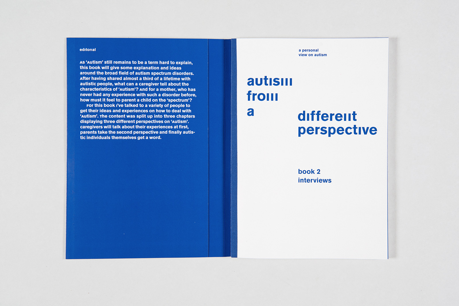
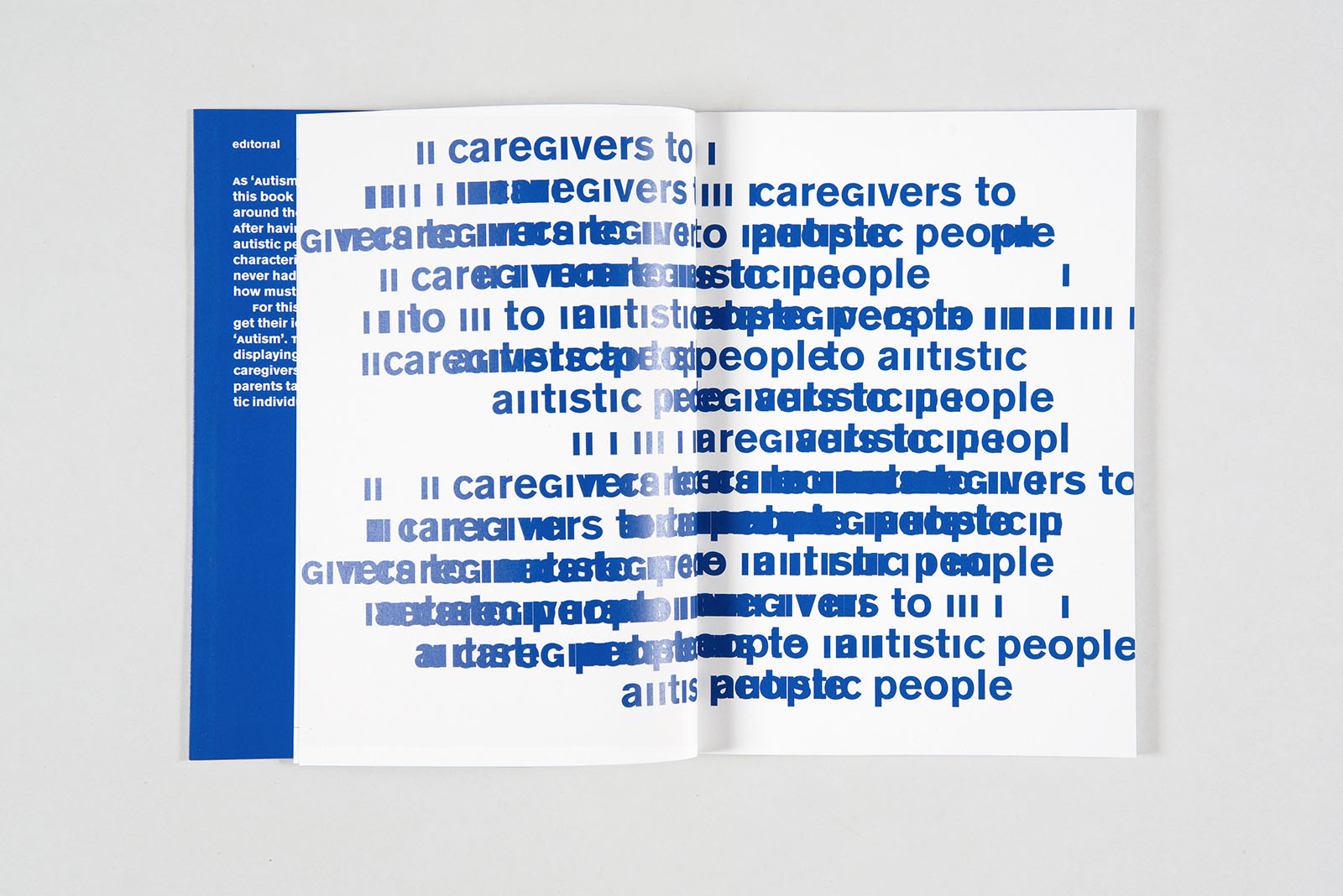
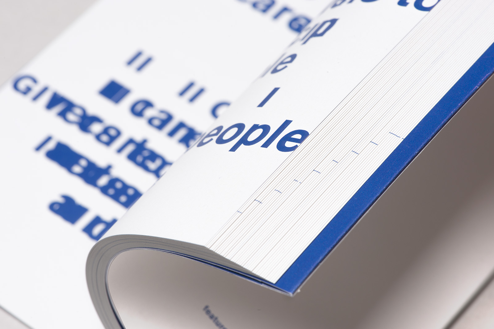
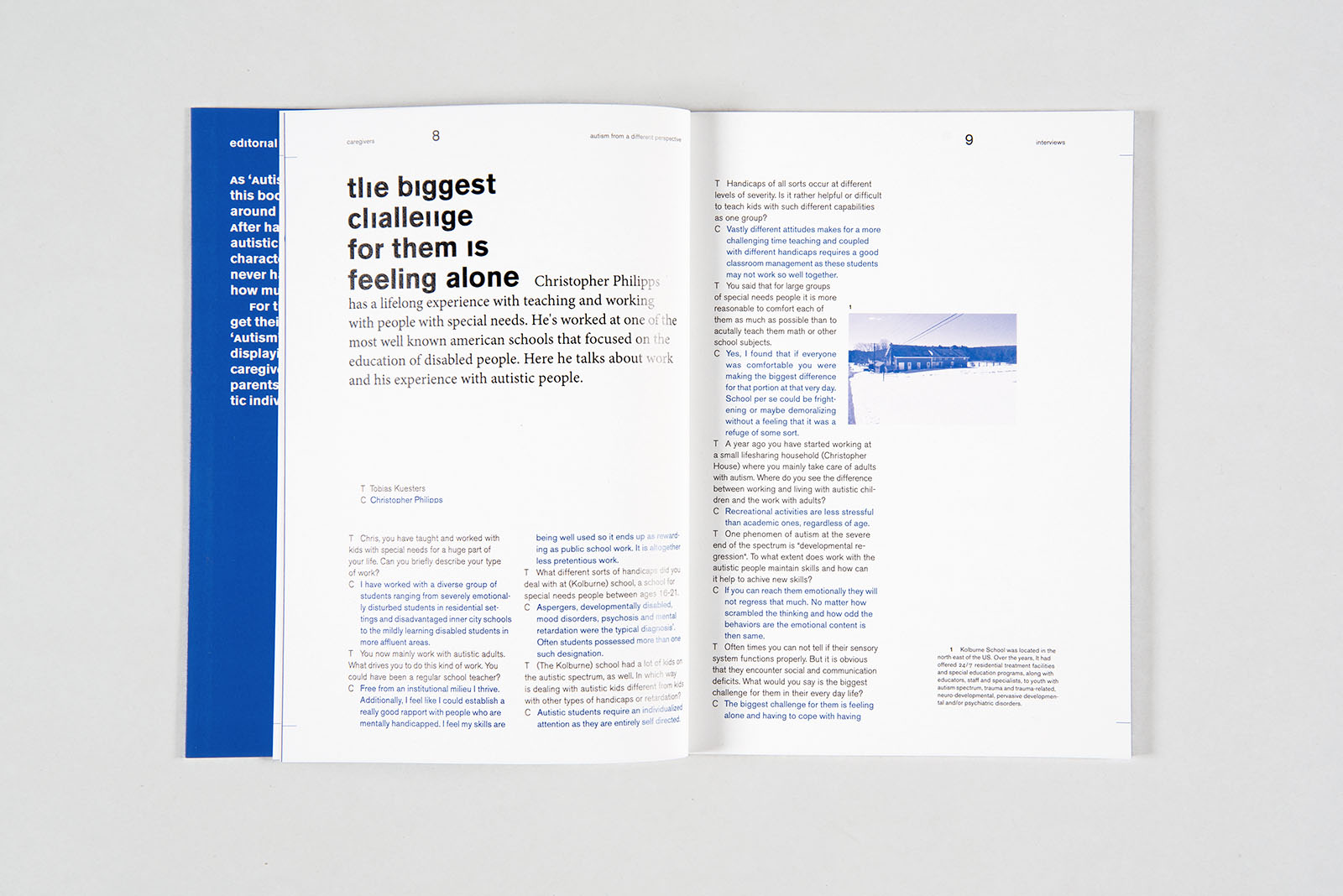
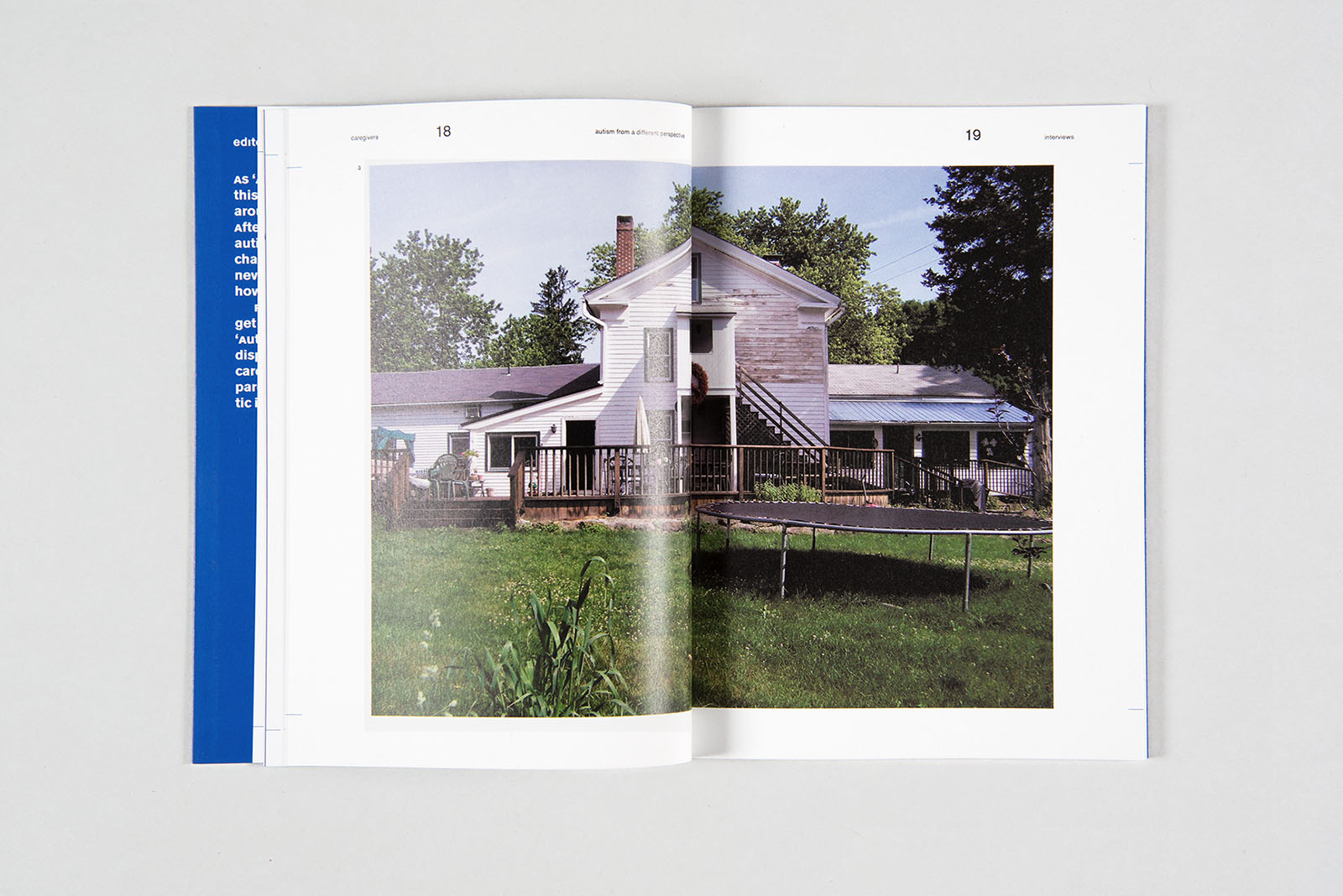
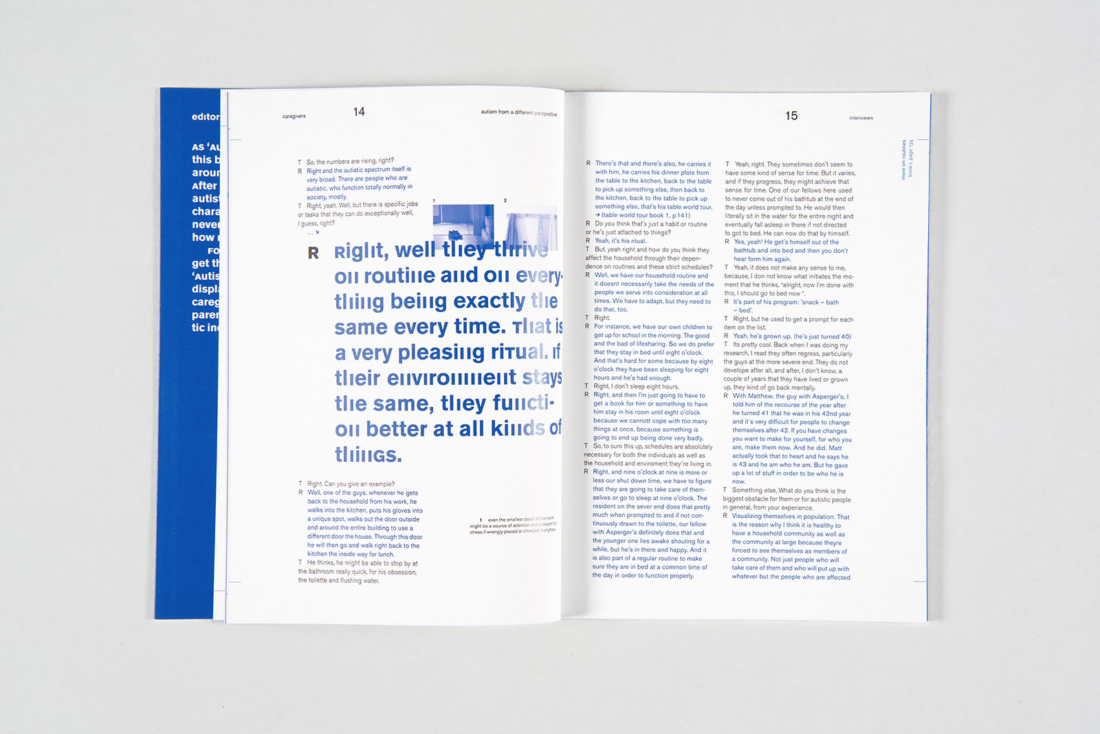
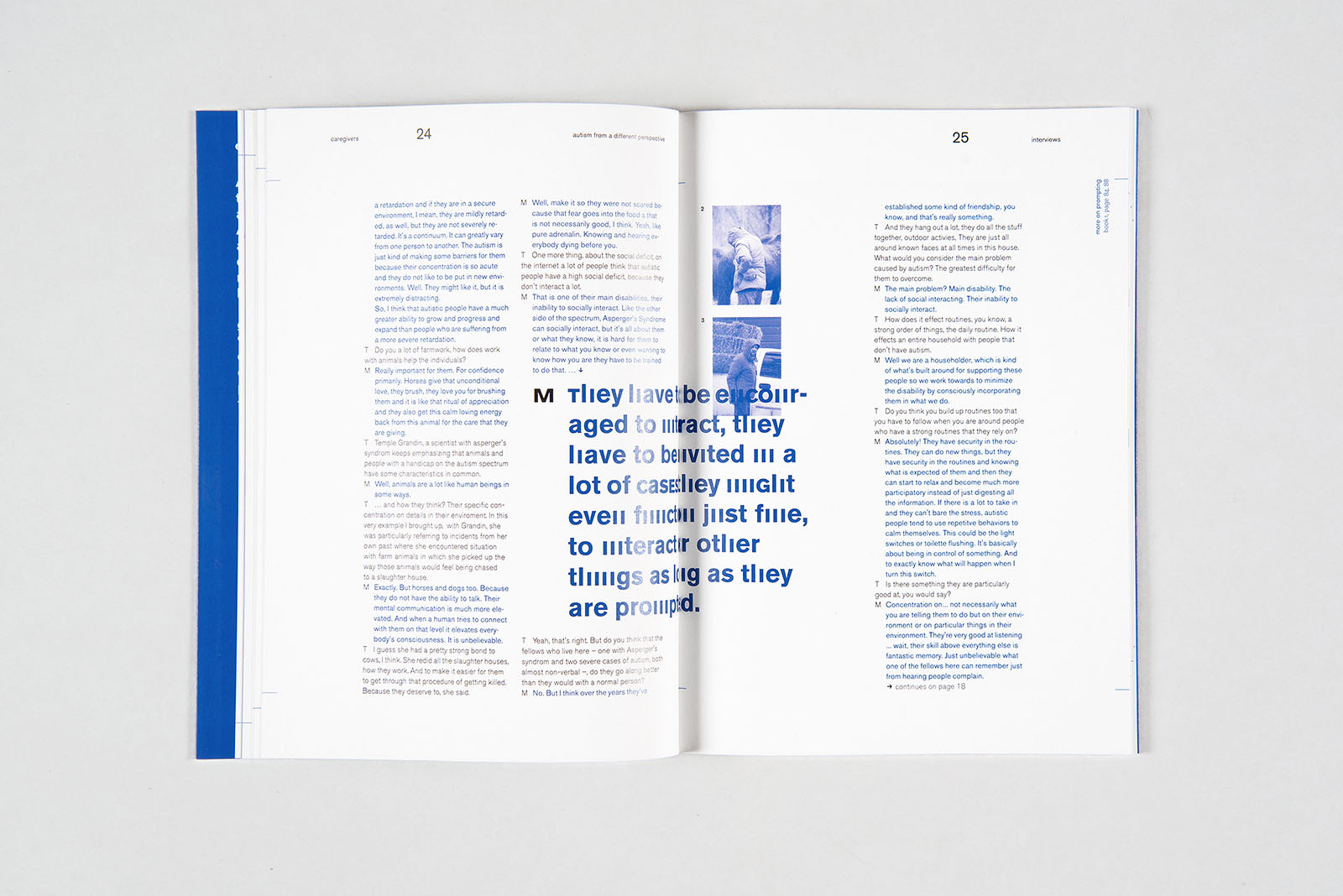
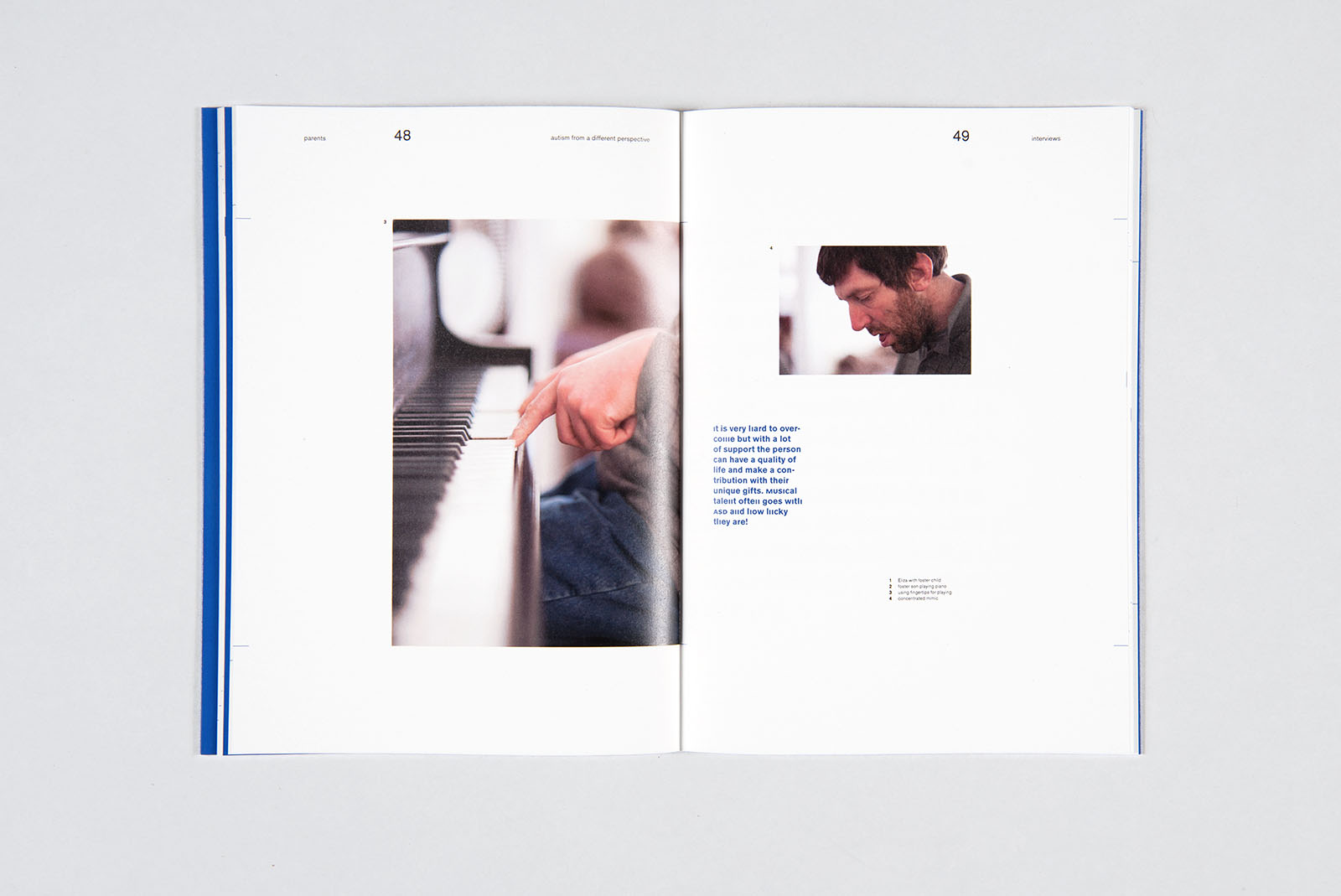
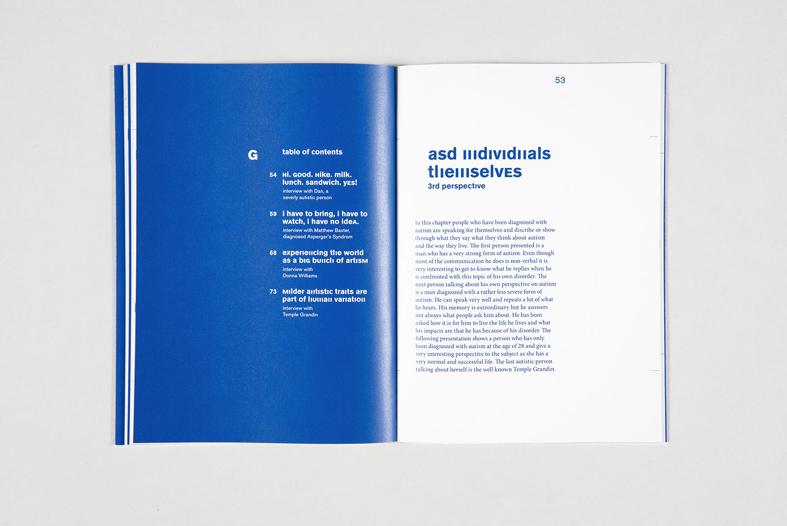
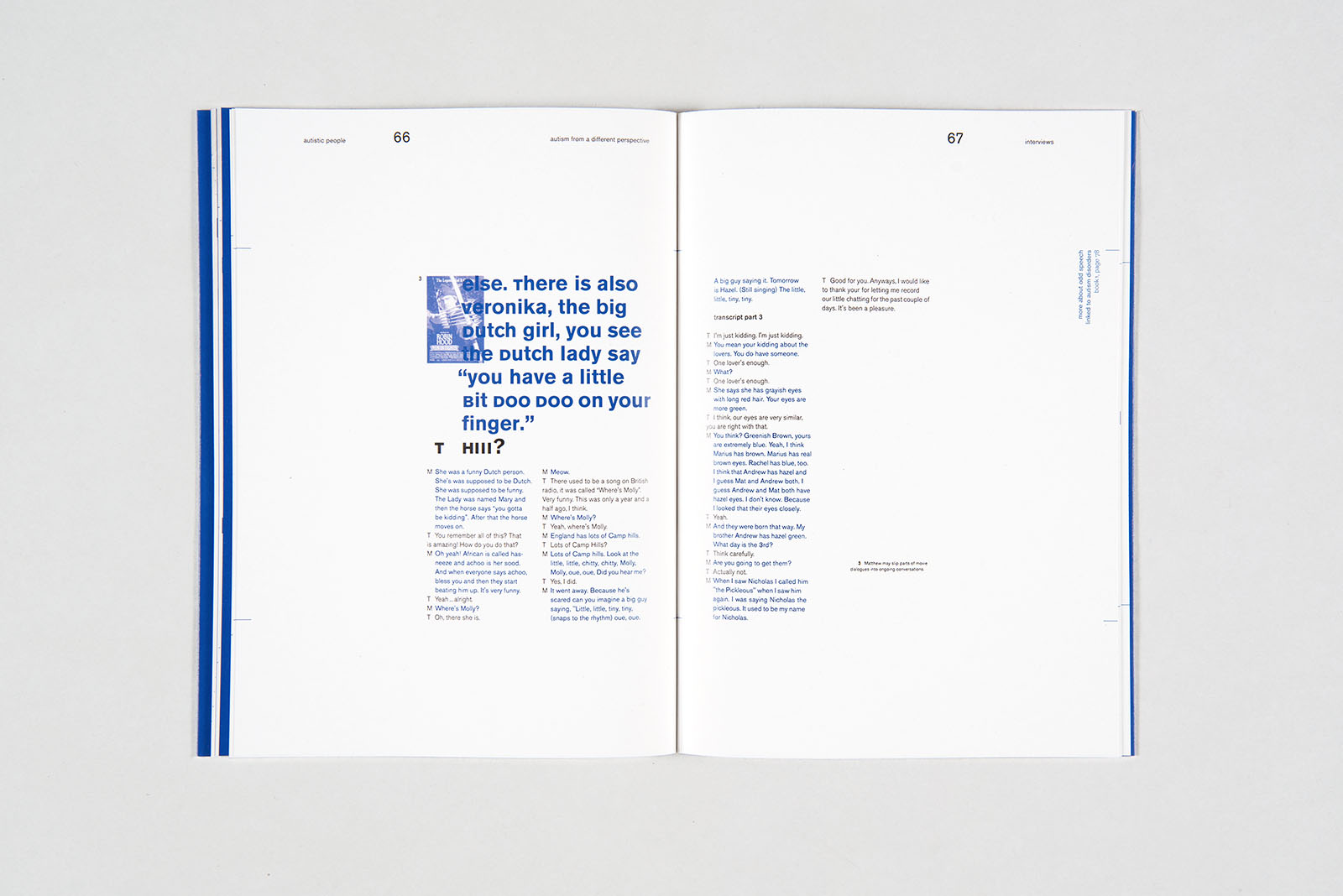
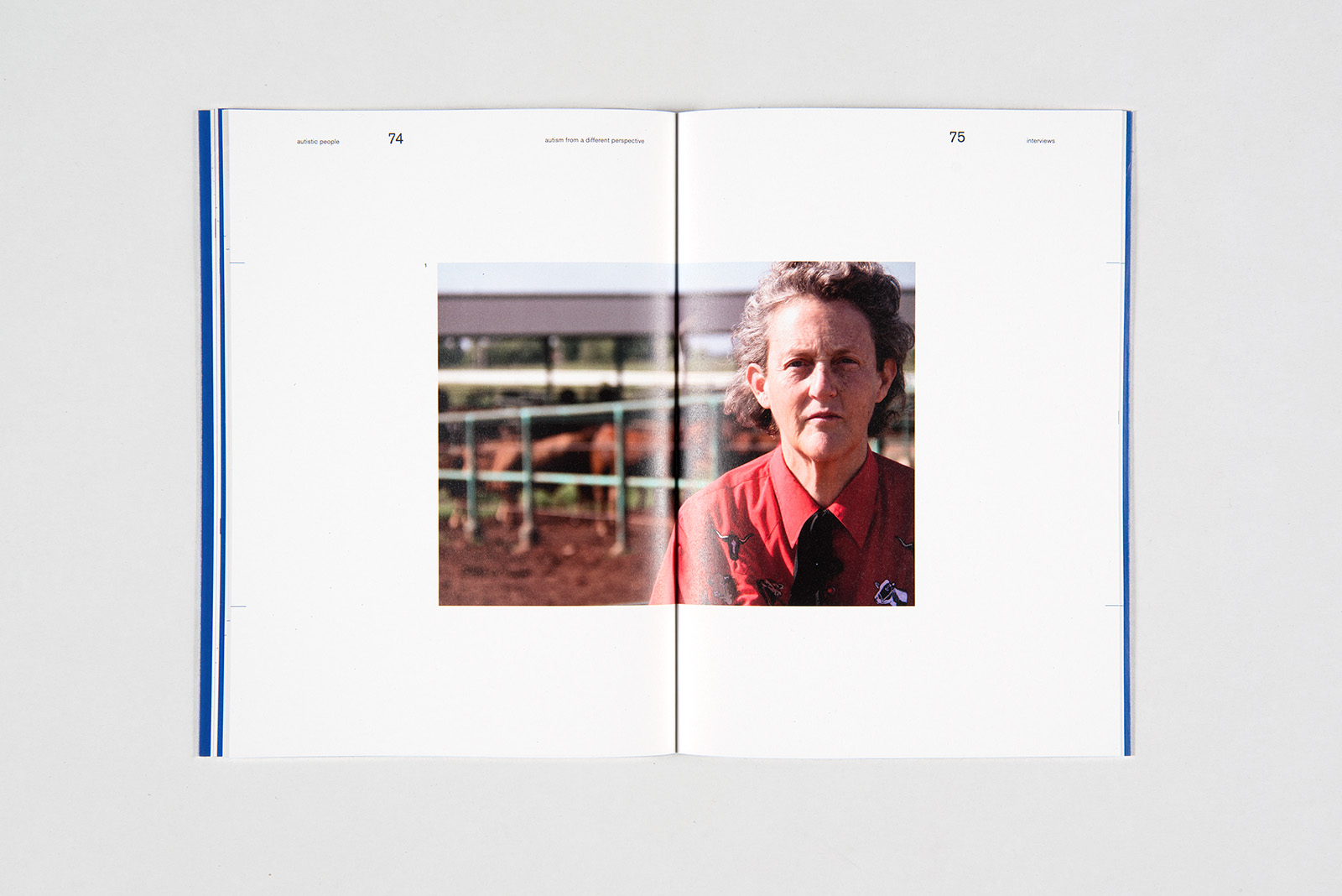
b.a. 'autism' part 1
year: 2014
type: type, editorial
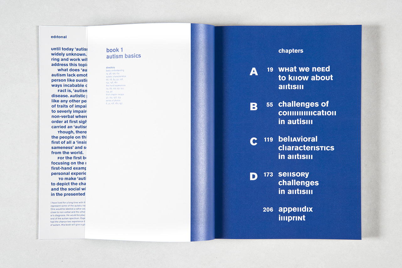
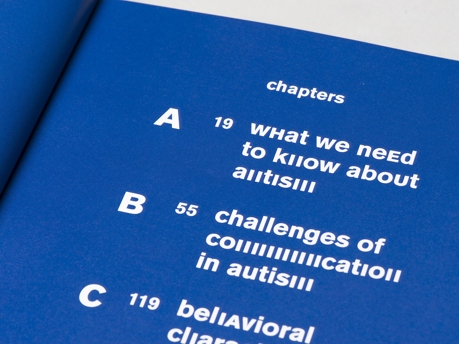
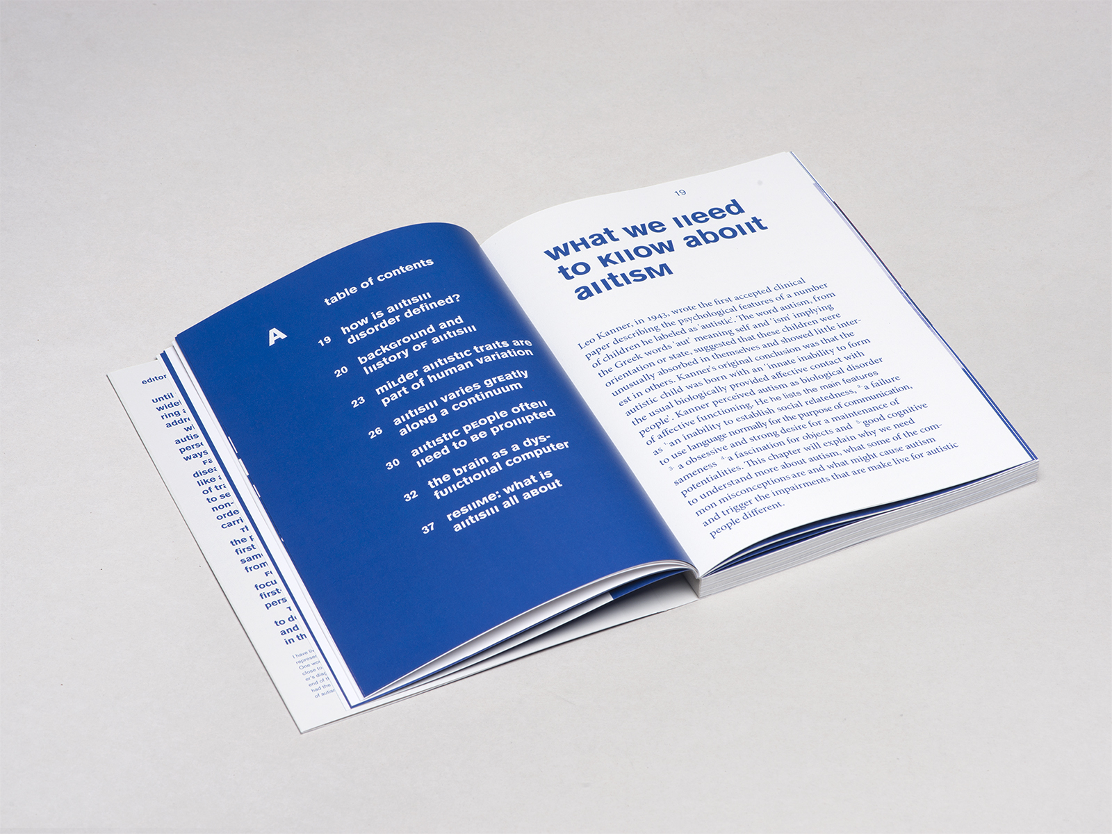
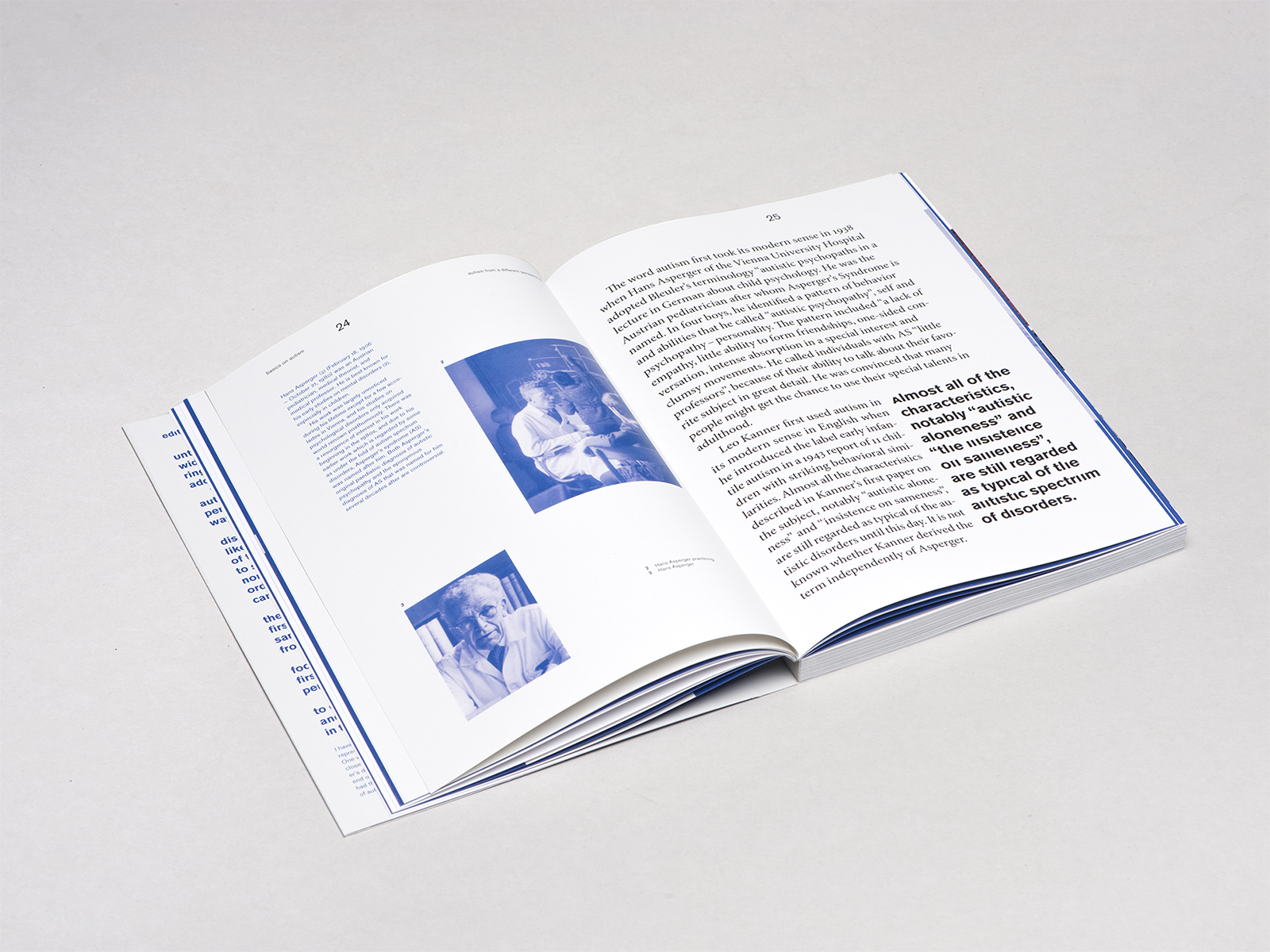
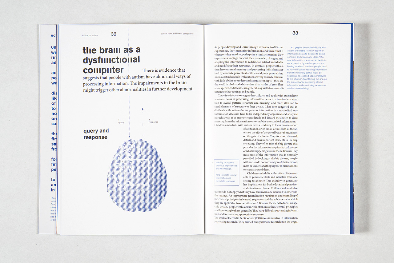
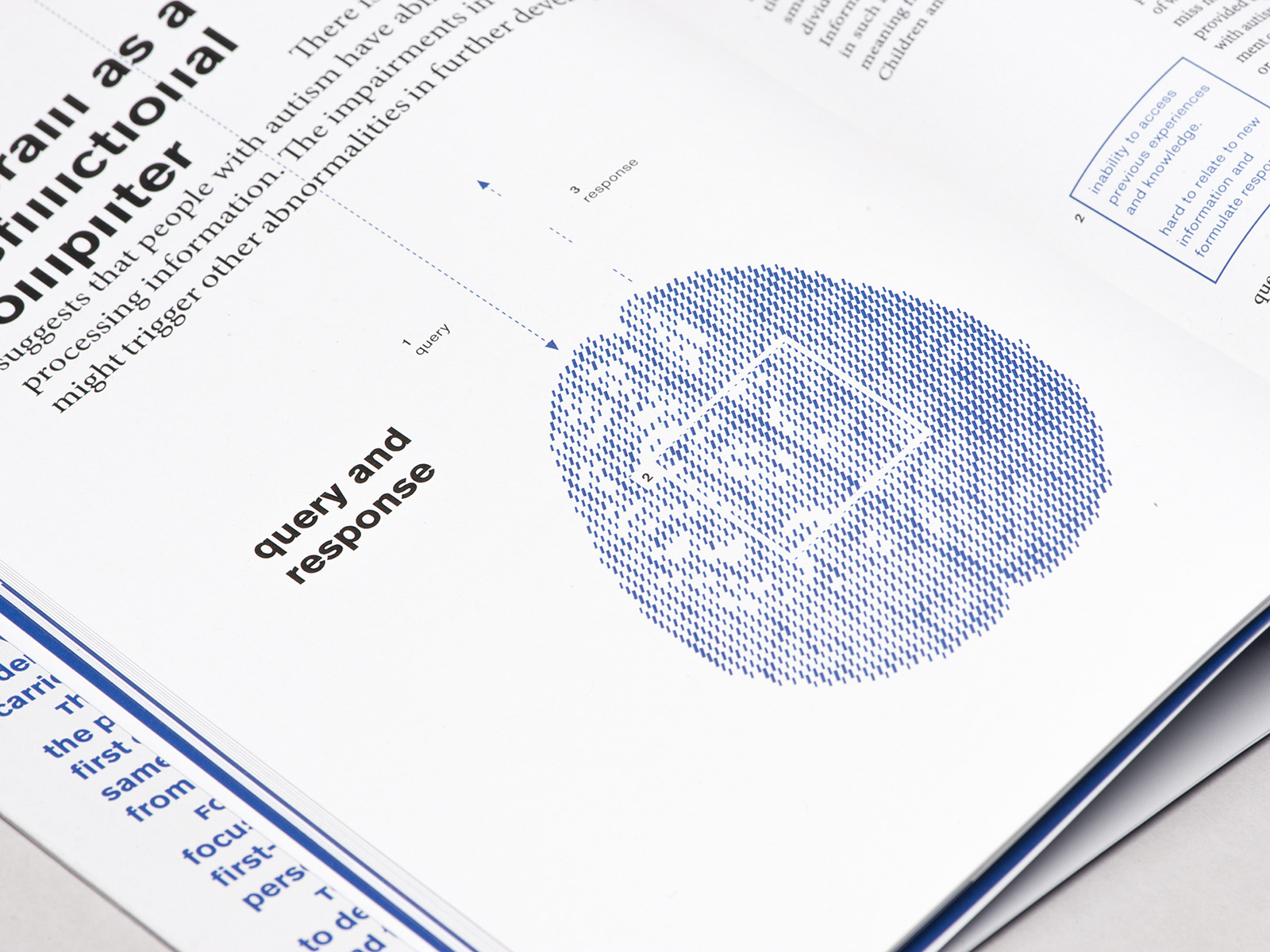
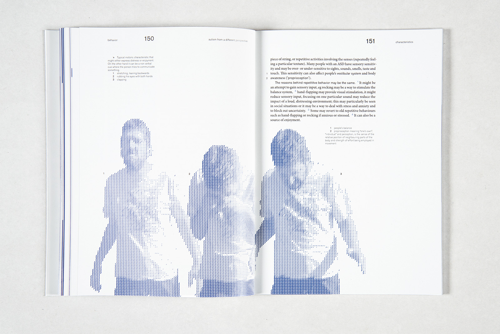
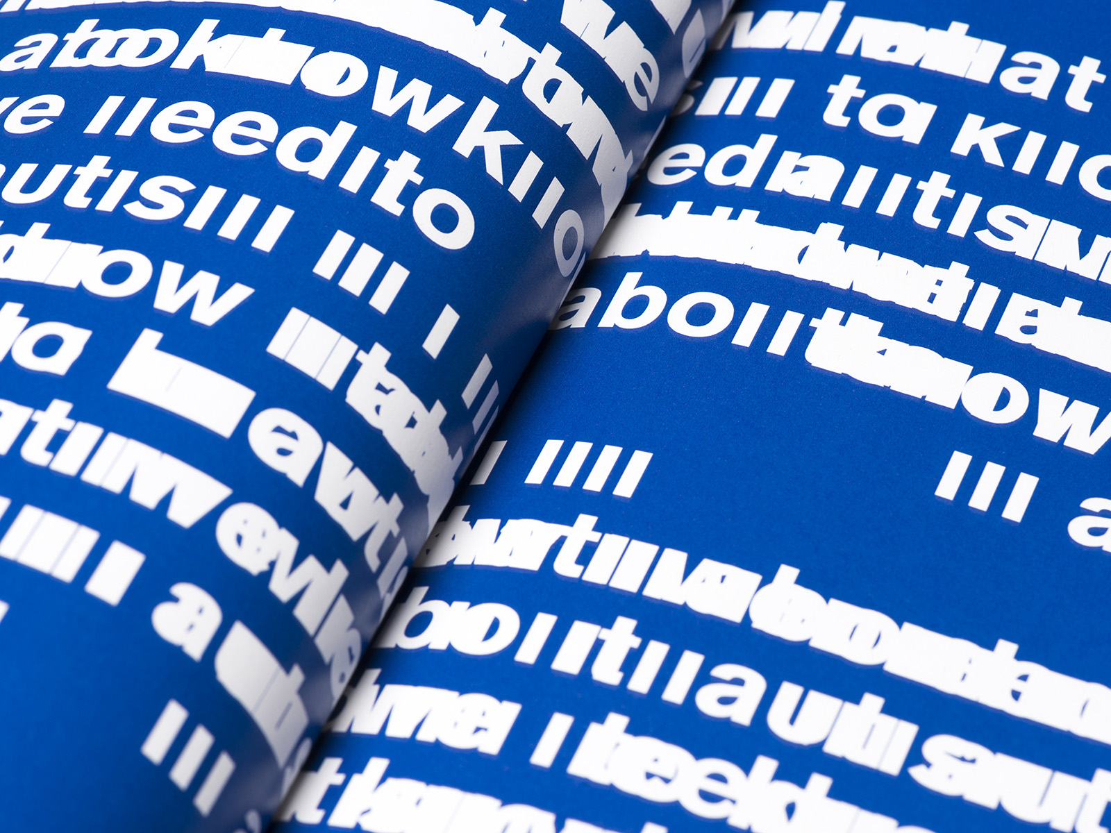
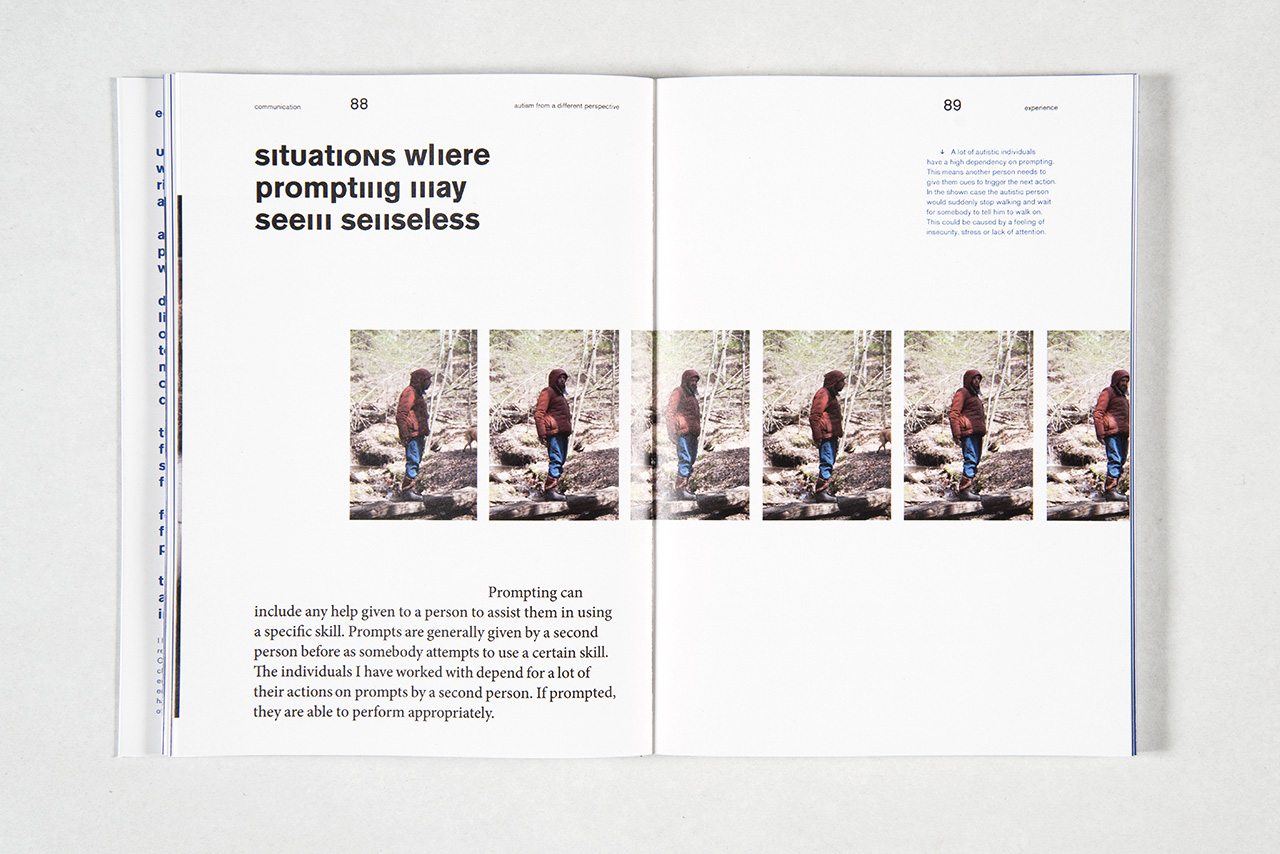
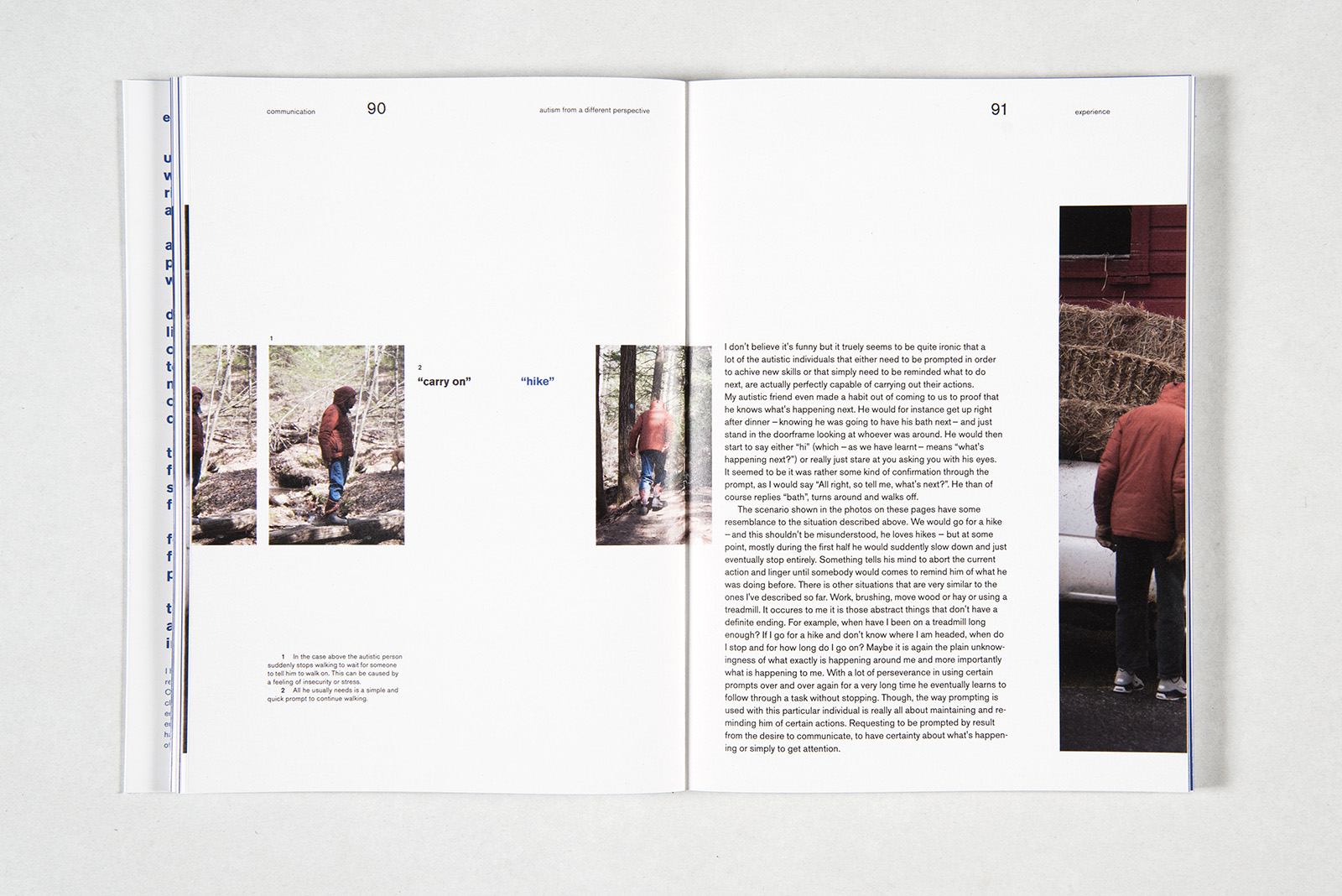
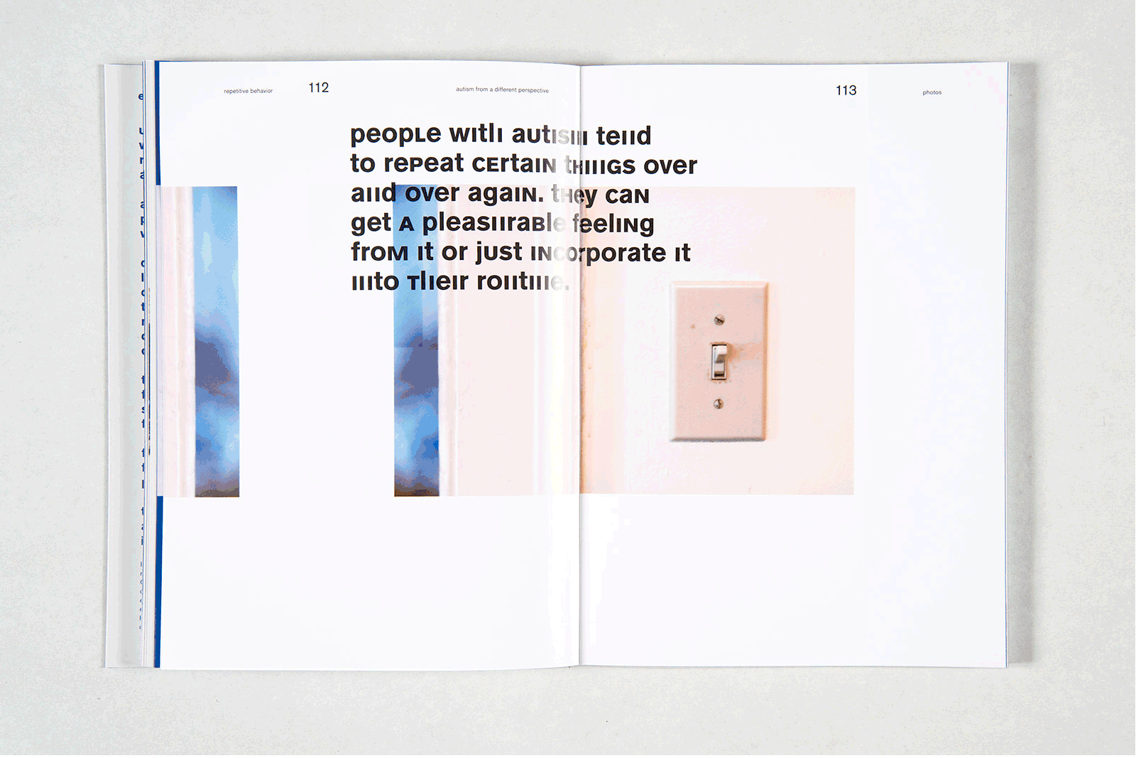
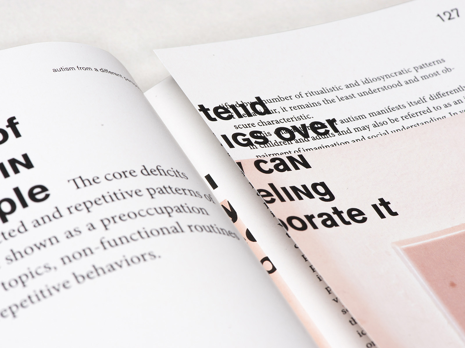
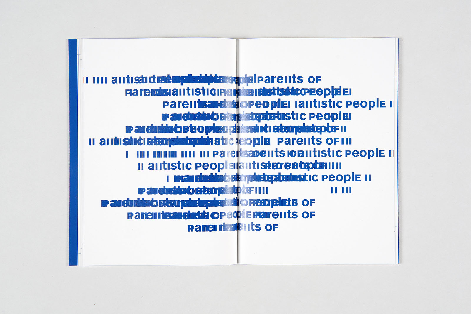
As ‘Autism’ still remains to be a term hard to explain, the books will give some explanation and ideas around the broad field of autism spectrum disorders. Autism’ describes a spectrum of traits of impairments ranging from mildly impaired to severly impaired. Though, there are a couple of features that most of the people on this ‘autism spectrum’ have in common; first of all a ‘insistence on routines, repetitions and sameness’ and secondly a ‘potential social withdrawal’ from the world.
To make ‘autism’ more comprehensible I’ve chosen to depict the characteristics of routines, repetitions and the social withdrawal visually and conceptionally. Two key visual elements reflect autistic behavior: repetition and withdrawal. Repetitions and overlays disturb the readability and represent the constant need for reoccuring routines in autism. A font modification was created for this book.
bachelor thesis
year: 2014
type: type
As ‘Autism’ still remains to be a term hard to explain, the books will give some explanation and ideas around the broad field of autism spectrum disorders. Autism’ describes a spectrum of traits of impairments ranging from mildly impaired to severly impaired. Though, there are a couple of features that most of the people on this ‘autism spectrum’ have in common; first of all a ‘insistence on routines, repetitions and sameness’ and secondly a ‘potential social withdrawal’ from the world.
To make ‘autism’ more comprehensible I’ve chosen to depict the characteristics of routines, repetitions and the social withdrawal visually and conceptionally. Two key visual elements reflect autistic behavior: repetition and withdrawal. Repetitions and overlays disturb the readability and represent the constant need for reoccuring routines in autism. A font modification was created for this book.
b.a. 'autism' part 2
year: 2014
type: type, editorial
As ‘Autism’ still remains to be a term hard to explain, the books will give some explanation and ideas around the broad field of autism spectrum disorders. Autism’ describes a spectrum of traits of impairments ranging from mildly impaired to severly impaired. Though, there are a couple of features that most of the people on this ‘autism spectrum’ have in common; first of all a ‘insistence on routines, repetitions and sameness’ and secondly a ‘potential social withdrawal’ from the world.
To make ‘autism’ more comprehensible I’ve chosen to depict the characteristics of routines, repetitions and the social withdrawal visually and conceptionally. Two key visual elements reflect autistic behavior: repetition and withdrawal. Repetitions and overlays disturb the readability and represent the constant need for reoccuring routines in autism. A font modification was created for this book.
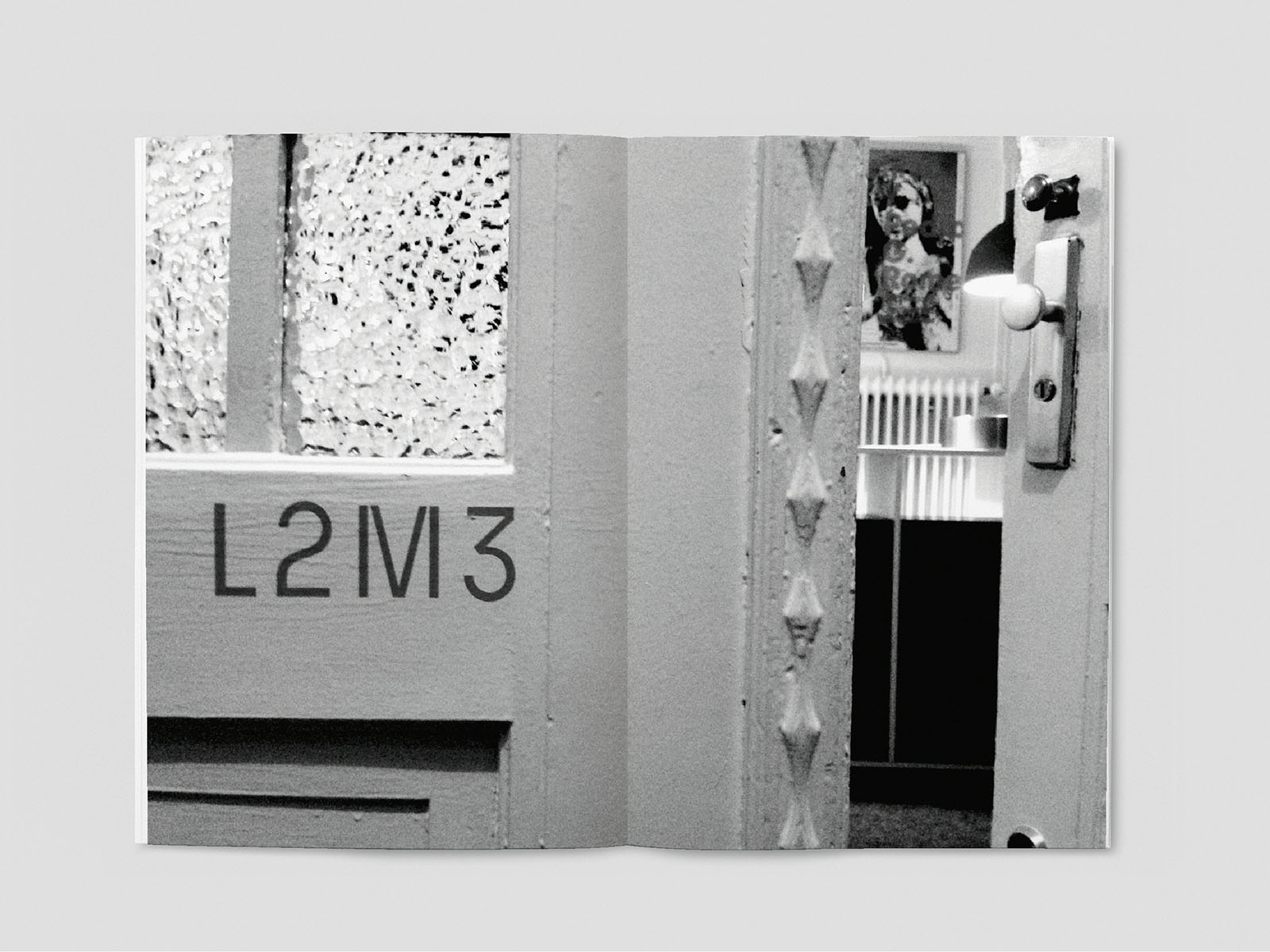
L2M3 internship
year: 2014
type: various, cooperation (mitarbeit)
Booklet I did after completing my internship at L2M3. Various projects that I have been engaged in throughout my time in the studio are displayed in different chapters based on the clientlist.
All projects were worked on under the supervision of L2M3 staff. Projects shown are copyrighted by "L2M3 Kommunikationsdesign GmbH".
visit l2m3.com for more information on the studio.
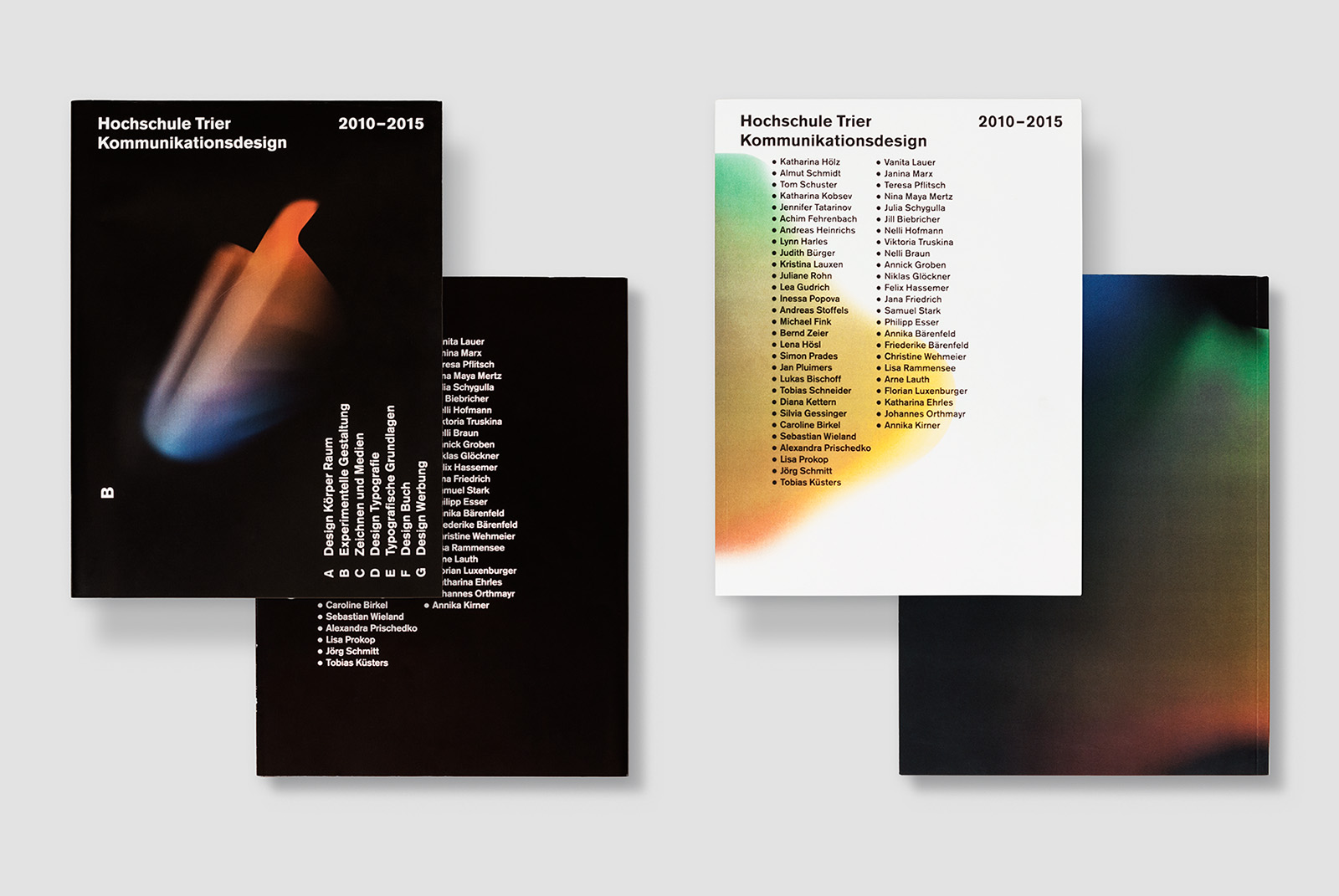
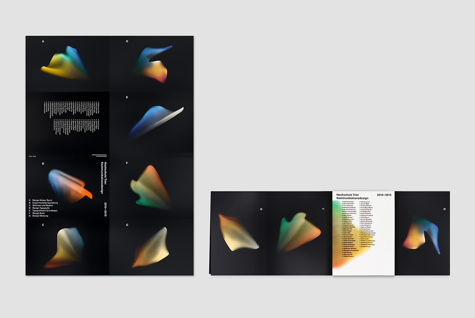
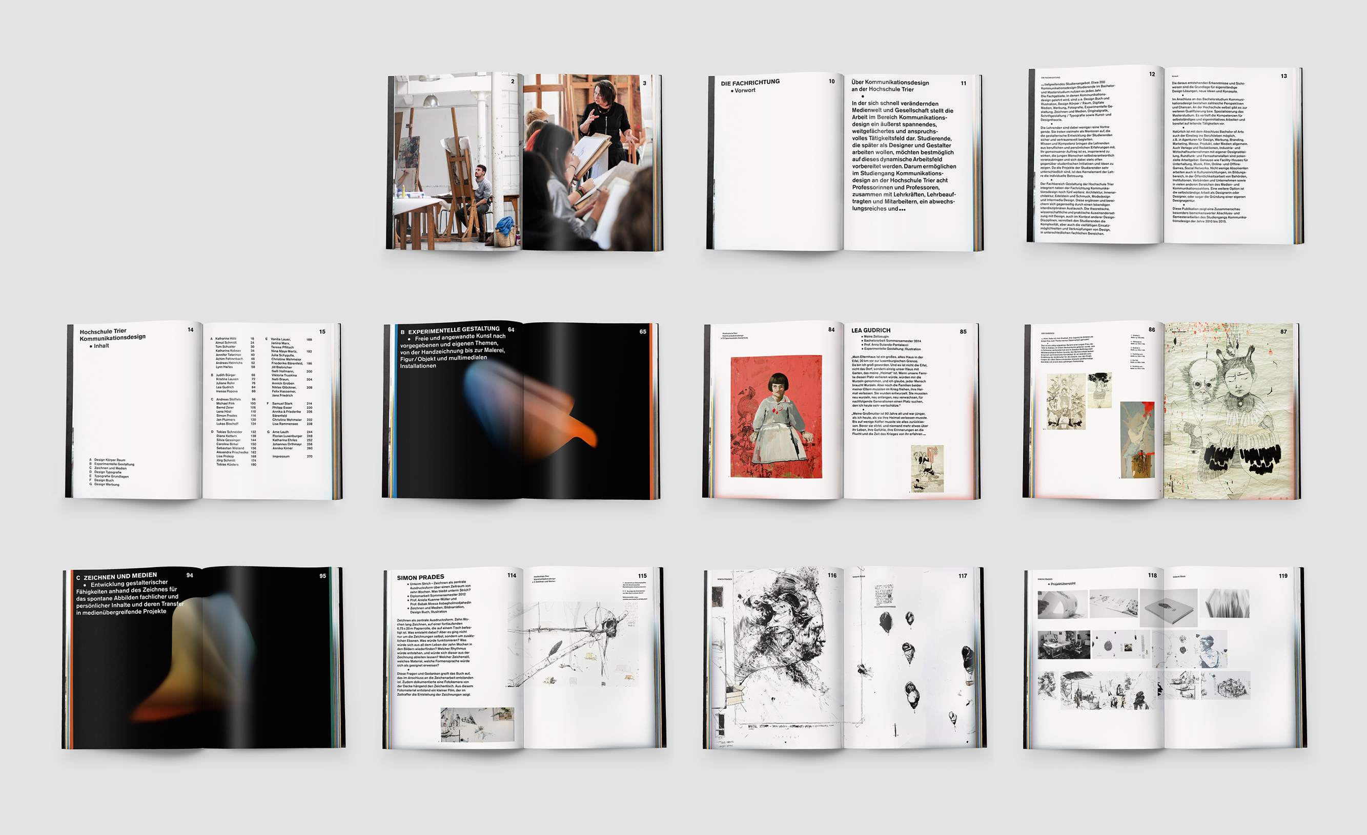
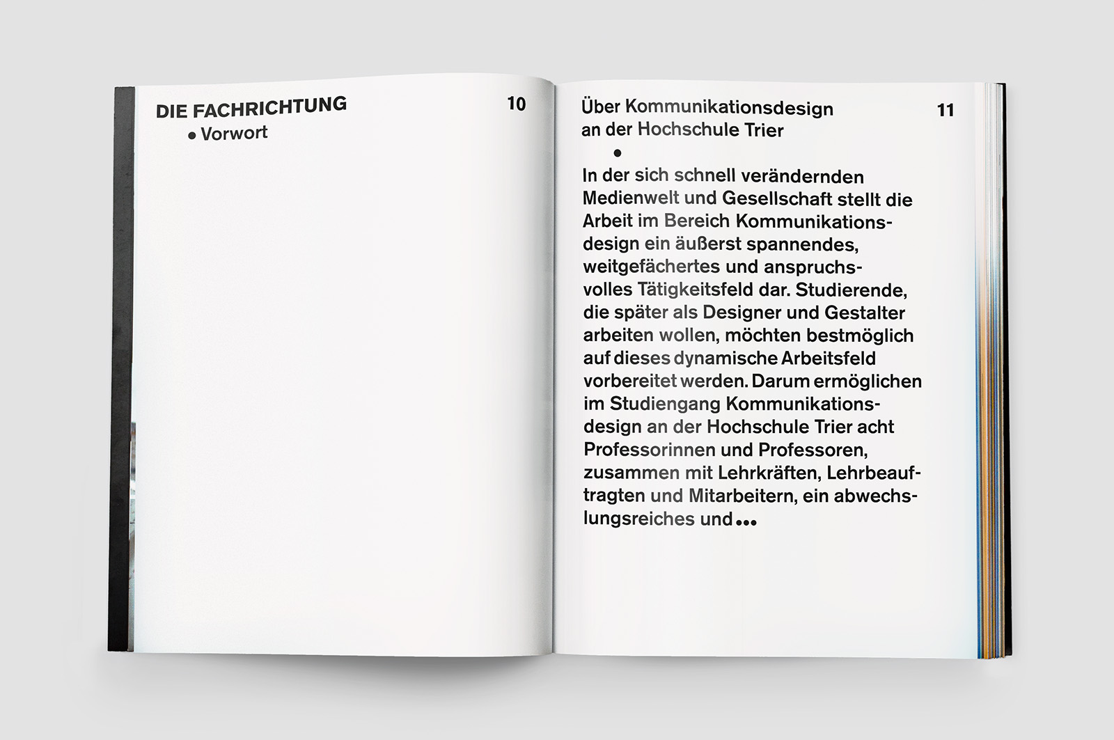
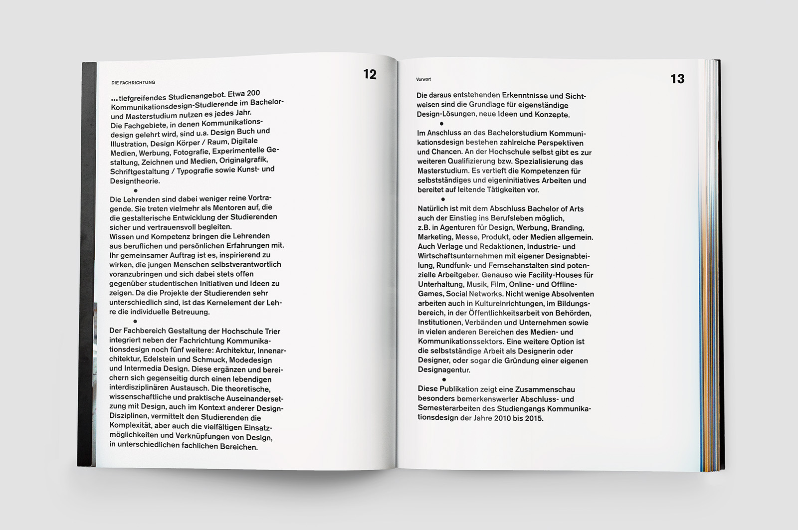
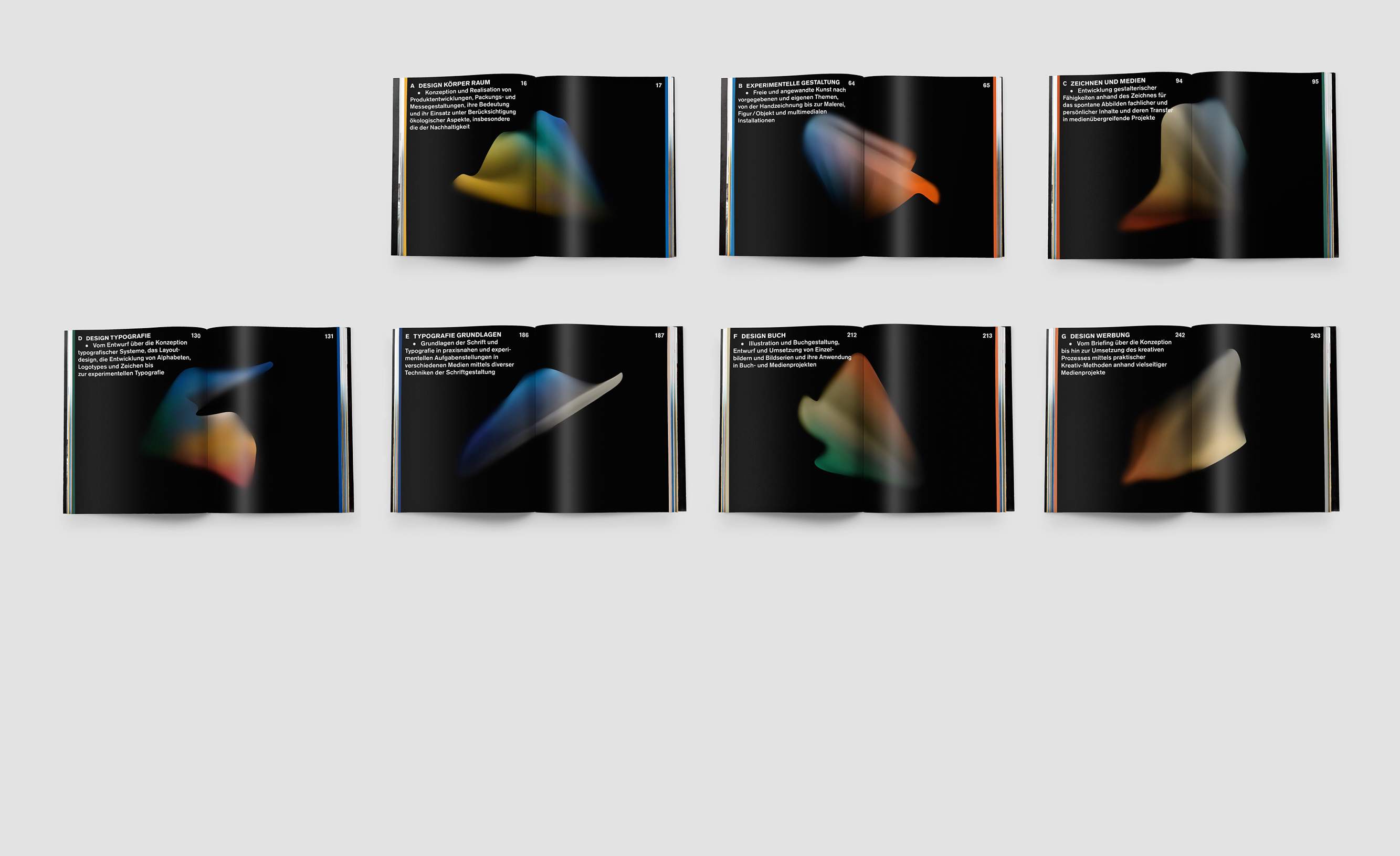
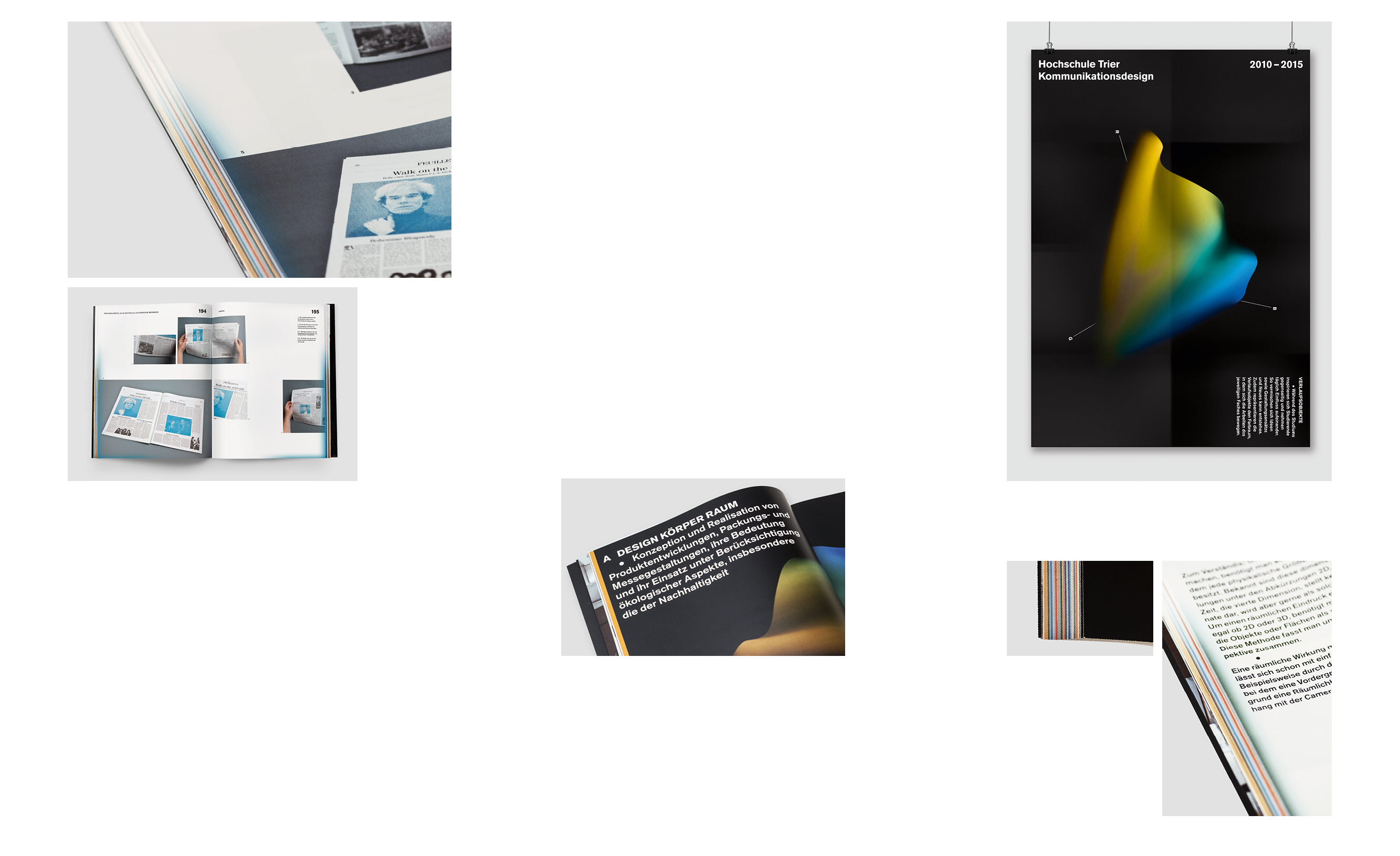
hs trier kd catalogue
year: 2015
type: editorial
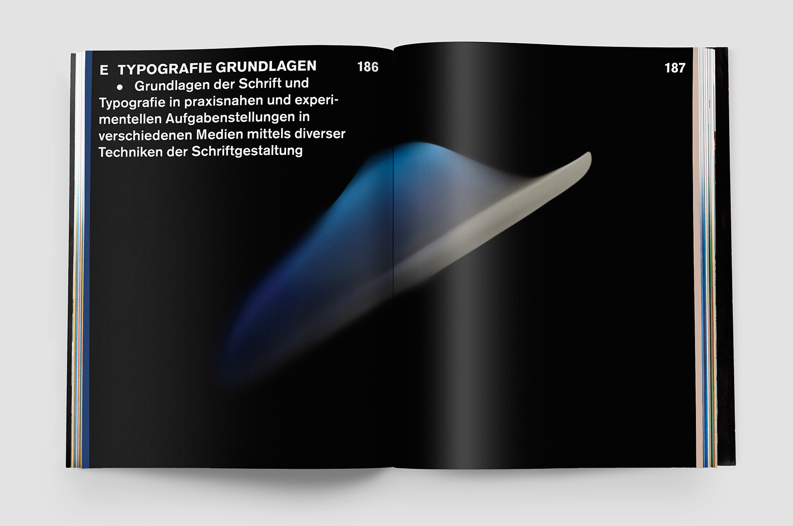
(translation coming soon) Im Auftrag der Hochschule Trier wurde ein Katalog mit den besten Arbeiten aus dem Fachbereich Kommunikationsdesign von 2010 – 2015 entwickelt.
Während des Studiums inspirieren sich Studierende gegenseitig und nehmen täglich Einfluss aufeinander. Ideen vermischen sich und Neues entsteht. Dreidimensionale Verlaufsobjekte greifen diesen Aspekt als Key-Visual auf. Sie repräsentieren die Farbräume, in denen sich die Arbeiten eines jeweiligen Faches bewegen. Alle Projekte sind farblich geordnet und erhalten durch Farbverläufe am Rand passende Farbklimata.
Die Typografie hat eine rohe Anmutung und soll identitätsstiftend sein, ohne sich zu sehr in den Vordergrund zu drängen. Der Schutz-Umschlag lässt sich zu einem Poster auffalten.
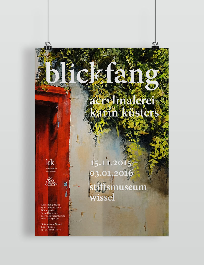
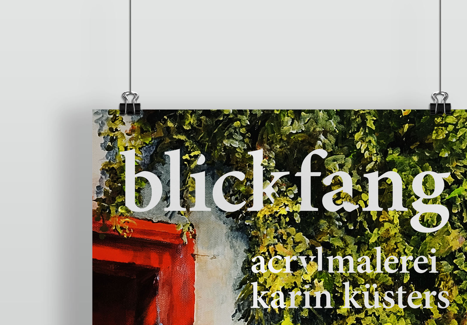
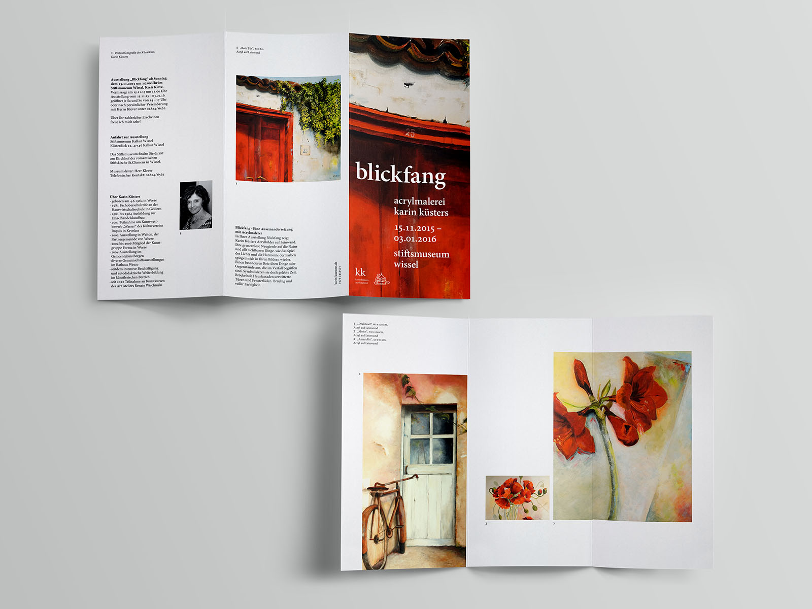
blickfang (KK)
year: 2015
type: flyer and poster design for art exhibit
(translation coming soon) Unter der Bezeichnung "Blickfang" eröffnet Karin Küsters ihre Ausstellung. Im Mittelpunkt stehen Objekte des Verfalls, Objekte "gelebter Zeit" und das Sichtbar-Machen von alltäglichen Momenten des Lebens.
Tobias Küsters entwickelte Ausstellungsflyer und -plakat, um diese Momente einzufangen und auf Werbemitteln sichtbar zu machen.